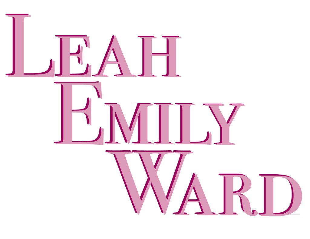
This typographical name logo contains my first, middle, and last name. I felt this allowed me to do more with my logo, which ultimately created a more aesthetically pleasing logo for this kind of design. I decided to use a serif font because I think it gives off a more feminine feel to it and looks more formal than a sans-serif font. I also decided to use all capital letters for this design to allow it to look bold. Furthermore, I decided to use different tones of pink because I’m very feminine and girly. Ultimately, the choice of pink for girls and blue for boys is what social scientists call a social construction (Figure 1). However, I feel the font and colours chosen reflects this girly aspect of my personality. Moreover, I aligned the text in a unique design, placing each name below the other, starting at the second letter of the name before. I believe this looks effective as I don’t have many letters in my name. The E’s from ‘Leah’ and ‘Emily’ are in line with each other which allows the words to flow down effortlessly. Additionally, the ‘M’ from Emily and the ‘W’ from Ward are in line with each other, which looks interesting as it looks like the ‘M’ has been flipped to create the ‘W’.
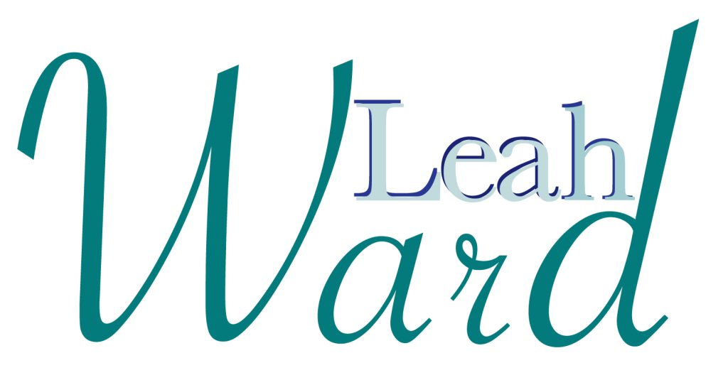
This typographical name logo contains just my first and last name, as I noticed I could intertwine these two names quite efficiently. I noticed the elongated letters of ‘W’ and ‘d’ in this font written in lowercase, allowed for a convenient gap for me to slot my first name in to. I decided to use two different fonts for this design, just to create more going on, so I’ve used a serif font for my first name and a script font for my second name. I’ve also used different shades of blue to show how blue shades can still look ‘girly’, and I think the fonts chosen really help with this which helps reflect my personality. Moreover, I created a 3D effect on my first name by offsetting it in the same font in a darker shade of blue, which I believe creates depth and stimulates the idea of three dimensions. It also brings attention to my first name, which is obviously the more important out of the two. Lastly, I think using just the two names looks more formal than three, which allows for a different type of design.
Reference List:
Figure 1: Elsesser, K (2023) Here’s How Pink Became A Girly Color. https://www.forbes.com/sites/kimelsesser/2023/07/11/heres-how-pink-became-a-girly-color/ [Accessed 2 November 2024].