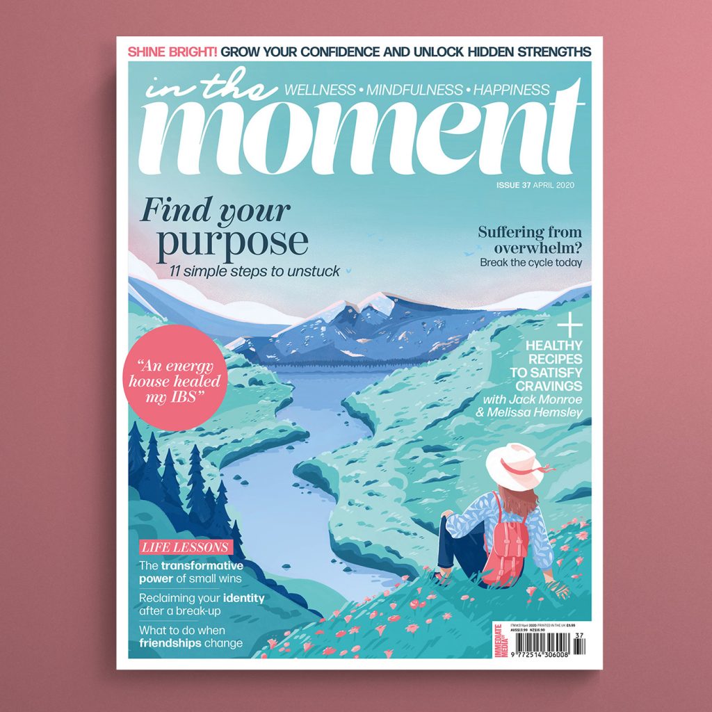
(Figure 1)
This is a good example of colour on a nature magazine cover which I have selected. This magazine is about generally feeling better as an individual, focusing a lot about connecting with nature due to the cover, but it also has other elements. I believe this image has been created digitally on a software which is something I like. For the use of colour, I enjoy the monochromatic tones of blue and green, and the pops of pink that have also been included. This gives the image a new style. The gradient in the sky gradually fades the colour from green to pink and looks very idealistic. Green and pink are also complimentary colours, so this all ties in. This cover design includes a pastel colour palette, which adds a soothing effect and sets the mood of the image. The colours aren’t harsh, or overly bright or saturated. In addition, there has been lots of attention to detail where the colours have been placed for highlights and shadows. This shows the amount of depth and detail that has gone into this. Dynamic range is very important and adds a lot to a design, as it makes images more compelling and memorable. Moreover, there has been an interesting amount of colour used to still create a colourful piece, but without making it confusing or all over the place. The amount of attention to detail is very admirable to the viewer. This cover reiterates the importance of mental health and how it’s important to try feel your best self, to be able to cope with the normal stresses of life (Figure 2). Ultimately, I believe the use of colour is the most important part in creating graphics as they communicate a message so strongly, which is what makes this magazine cover so captivating.
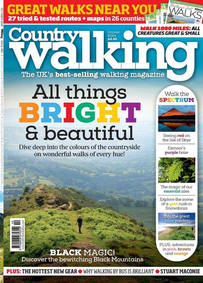
(Figure 3)
This is a bad example of colour on a nature magazine cover which I have selected. This magazine is all about encouraging walking, but I don’t think it does a very good job at promoting this. Initially, I noticed how much I didn’t like the individual letters of colour in the word ‘bright’. I see that they were trying to match the colours with the word, but it just doesn’t fit with the theme of this cover at all and I think it makes it look cheap. There is also random selections of colour in other words around the cover, also not benefiting this design. In addition, there is also a red strip of colour containing some yellow text at the very top of the cover, which looks very uncomplimentary and unnecessary with the rest of the cover. Lastly, the main image of the cover appears fairly dull and lacks tonal variation, with most of it appearing blurred, therefore not giving us much to look at. Ultimately, I think the whole cover clashes with each other and doesn’t demonstrate the use of colour and what it can do for a design.
This is my redesigned demonstration of a refined example of the bad magazine cover. I changed these colours using Colour Books. I decided to still experiment with the world ‘Bright’ by changing it to a green shade, to tie in with the grassy mountains. I eliminated the red strip at the top and decided to give the first half of the title, which is ‘Country’, more space and place that there instead, matching the colour of the sky. Along the strip on the right hand side, I changed lots of the text to be the same colour as the rest, apart from the word ‘spectrum’ I added another green shade, to almost hint at the spectrum of green shades amongst the design and amongst nature. These multiple different greens around the design are examples of monochromatic colours. Lastly, I also changed the brightness and saturation of this cover, as I felt the original image looked fairly dull and lifeless. Overall, I believe these steps have created a much more harmonious piece which is much more pleasing to the eye.
Reference List:
Figure 1: Goldhawk, H. (2024) Behance. https://www.behance.net/gallery/96083189/In-The-Moment-Magazine-Covers [Accessed 16 October 2024].
Figure 3: Greatmagazines.co.uk. (2019) Country Walking Magazine Subscription. https://www.greatmagazines.co.uk/country-walking-magazine [Accessed 16 October 2024].
Figure 2: Plumptre, E. (2023) The Importance of Mental Health. https://www.verywellmind.com/the-importance-of-mental-health-for-wellbeing-5207938 [Accessed 30 October 2024].