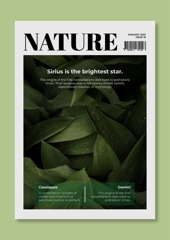
(Figure 1)
This is a good example of typography on a nature magazine cover which I have selected. My chosen subject is all about nature, focusing mainly on the importance of getting outside and going for walks. This has a huge list of benefits for our mental and physical health, that I believe should be spoken about more. Walking for just 30 minutes everyday is a great way to improve your overall health (Figure 2). My target audience is people around my age, young adults, a difficult time to know what to do be doing with your life. Initially, on this magazine cover, I noticed the bold, clear title on this magazine cover. A serif font has been used which I think compliments the aesthetic of this cover. It’s very aesthetically pleasing so it intrigues the viewer, perhaps making us want to read more. Serif fonts also help the eye travel across the line. It could also be argued that the serif font resembles the curvatures of nature. Additionally, I also enjoy that there isn’t a large amount of fonts on this cover, as this can confuse the viewer and make it seem overwhelming. This cover has around 3 fonts on the whole page, allowing for a simplistic look and an easy viewing experience. These fonts also included a mixture between serif and sans serif fonts, which adds variation. I also enjoy that the text at the top of the cover is in black, whereas the rest is in white. This creates a clear distinction between the title and additional information. This monochromatic colour scheme looks sophisticated and timeless, which intrigues the viewer. Moreover, in front of the image, the sub topic titles are in a bolder version of the font than the the description, which makes it clear to the viewer what they are reading. Lastly, I enjoy that there is a perfect amount of writing to take in, enough to ensure we understand the contexts of the magazine, but not too much to confuse and puzzle the reader.
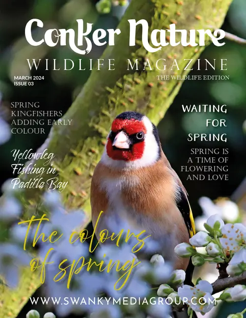
(Figure 3)
This is a bad example of typography on a nature magazine cover which I have selected. Within this magazine cover, I think too many different fonts are used, which isn’t very aesthetically pleasing for the eye. When I look at this cover, I feel like I didn’t know where to read first, which is not what you want a magazine cover to do. A magazine cover should clearly and distinctly state the title and what the contents may include. There is such a wide variety of fonts which I don’t think compliment each other. There’s serif, sans serif, and cursive fonts. I find the type choices on this cover to be very randomly selected without much thought behind it. Additionally, some fonts are more bold than others and are lots of different sizes throughout the whole cover, which doesn’t give any of these things any purpose, and actually just confuses the viewer as there is too much going on. I believe these various methods combined makes it hard for the magazine cover to get its point across of what its context is about. Moreover, there’s also a random switch from the words being spelt out completely in capital letters, then straight back to normal writing. This is another reason I feel that there’s just too many differences, that it looks unorganised. Lastly, I don’t enjoy the random pop of colour in the writing ‘The colours of spring’. I think it clashes with the rest of the colour scheme and looks out of place.
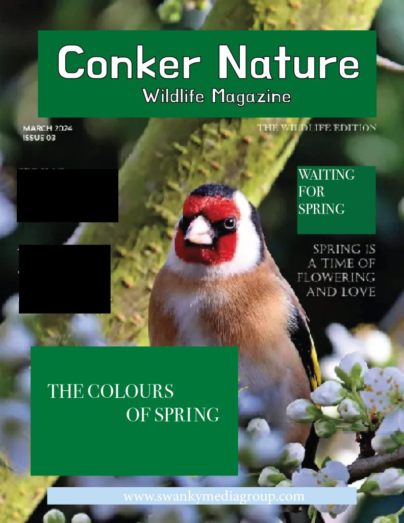
This is my redesigned demonstration of a refined example of the bad magazine cover. The squares of block colour around this are to cover the original writing and to imitate where the background image would be. Initially, I completed got rid of some of the writing on the left side by covering it, due to there being an overwhelming amount of scattered text on the original cover. I then changed the font of the title and subheading to the same, simplistic font, to simplify the cover. I added black around the edge of this text to ensure it stood out more than the rest of the text. Lastly, I changed some of the other fonts around the cover to ensure they tied in overall better with the cover and made these all white, as I don’t think any more colour is necessary when the image of the bird is already filled with colour. Ultimately, I believe this has made for a much more complimentary and captivating magazine cover.
Reference List:
Figure 2: Better Health Channel (2023) Walking for good health – Better Health Channel. https://www.betterhealth.vic.gov.au/health/healthyliving/walking-for-good-health# [Accessed 30 October 2024].
Figure 1: Freepik (2024) Professional Outside Nature Magazine Cover template. https://wepik.com/template/professional-outside-nature-magazine-cover [Accessed 2 October 2024].
Figure 3: Morris, L. (2024). Conker Nature Magazine – Accepting submissions on Kavyar. https://kavyar.com/conker-nature-magazine [Accessed 2 October 2024].