Onboarding
Onboarding is the process of guiding new users or participants so they can quickly understand, feel comfortable, and get value from a product, service, or experience. An example of how I’ve included this is on the home page saying ‘Welcome to Flavour Fest 2025!’, to set the vibe and introduce the festival to the user. The menu is also a good example as it’s a guided walkthrough which shows users how to use the key features and see what’s on offer. This is all the onboarding I have achieved so far. Onboarding helps to boost first impressions as people decide fast if they like something. Friendly, clear onboarding helps users feel welcomed and confident.
Responsive Layout
A responsive layout is a design approach where the app or website automatically adjusts to look and work on any screen size such as a phone, tablet, or laptop. It gives the content the ability to be flexible and adaptable, depending on the space it’s in. This is important as people use multiple devices, often switching between them. It keeps the design looking clean, readable, and usable everywhere. At the moment, I’ve done this by adding two white columns either side of the website design, to keep it looking and fitting as similar to the apps dimensions as possible.
Logo
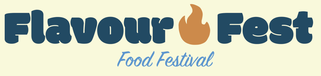
This is my logo design for my food festival called ‘Flavour Fest’. I’m really pleased with my logo as I think it truly sets the tone and makes the brand feel very real. It has a clean and bold appearance which is also unique. Whilst creating my logo, I did some research on the top principles for a logo, and the top one is ‘Keep the design clean and simple, and don’t overcrowd it with detail.’ (design102, 2023). I believe I have achieved this balance. In addition, I believe a successful logo needs to be easy to recognise and remember and not be overly detailed, which I think mine has, as a cluttered design could be overwhelming for the viewer. Moreover, I included the fire element in my design to reflect the spices and flavours that will be at the festival, which reflects the vibe and theme of the festival by creating a hint at the food. In addition about the fire, it’s a vibrant “tasty” colour of orange, fitting with the vibe of a food festival. The other blue tones in the text also creates a contrast with the deep blue and warm orange, it feels modern, tasty, and festival-friendly. I created a neutral background so it matches in any context it’s used and also a soft background colour keeps it from feeling too heavy. Moreover, I have included bold fun serif fonts to match the vibe of the festival and I think these are very eye catching and captivating. The ‘Flavour Fest’ text is chunky and playful which is great for an event, then the cursive ‘Food Festival’ underneath adds elegance and balance. This creates a good use of contrast between the styles. Lastly, I believe the composition has been utilised well as everything’s centred and feels cohesive. The mix of weight and movement makes it eye-catching. Ultimately, I believe I’ve created an aesthetically pleasing logo for my Flavour Fest food festival.
Reference List:
UK, GOV. (2023) What are the top principles for great logo design? – Design102. https://design102.blog.gov.uk/2023/08/25/what-are-the-top-principles-for-great-logo-design/ [Accessed 14 April 2025]