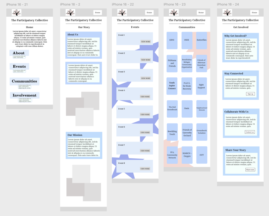
Design Progress:
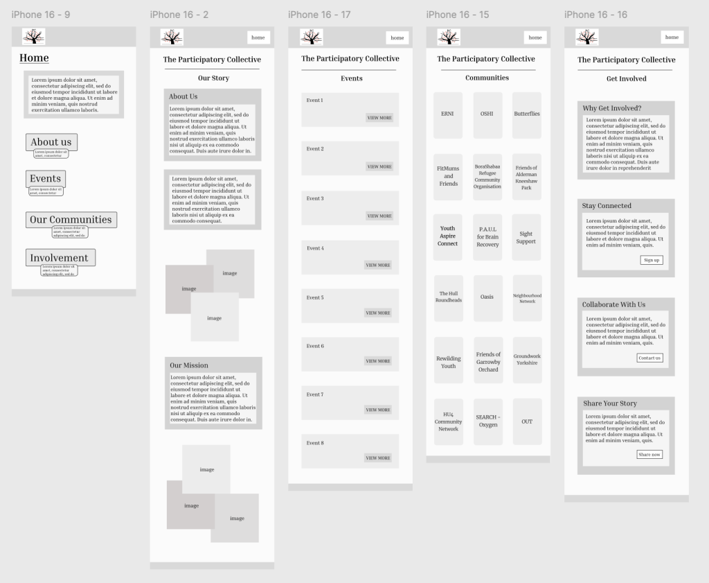
These were my mobile designs created along the way of the creative journey, as I wanted to include screenshots regularly to show the progress and not wait until it’s completely finished. In the early stages of my layout development, I naturally focused on the overall structure and flow of each page, before introducing more refined elements. These initial wireframes, which aren’t all shown due to a lot of progress, allowed me to experiment with hierarchy, spacing, and the placement of key content blocks. At this point in the process, my priority was ensuring users could easily understand where to find information, and how the different sections connected across the site. These early layouts played a crucial role in my development, helping me decide which elements needed emphasis, which areas required simplification, and how the overall platform could support both storytelling and engagement in a clean, structured way. These refinements help create a smoother, more organised user journey that is accessible and supportive of how people naturally navigate information.
Prototype Adjustment:
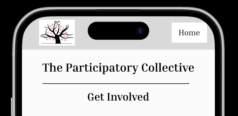
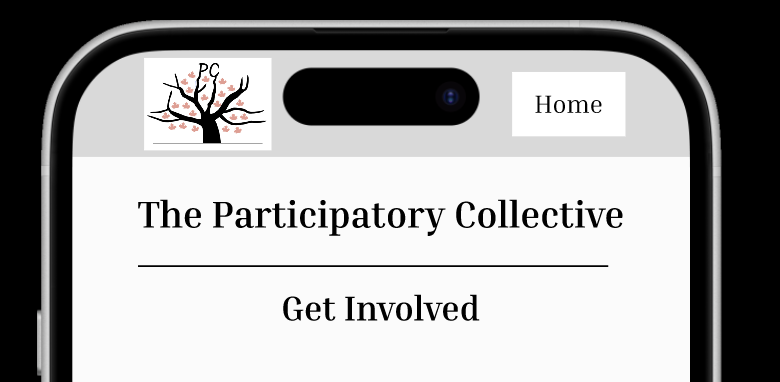
When I moved into the prototyping stage, I noticed that the spacing within the header section felt unbalanced, particularly around the logo and the ‘Home’ button. The elements appeared too close to the edges and were cut off, which made the layout feel cramped and reduced the clearness. To resolve this, I adjusted the alignment so that each component had consistent breathing room. I increased the spacing around the logo to avoid it sitting too close to the edge of the screen and repositioned the navigation button to create a more even horizontal layout, which improved the overall visual hierarchy. I believe these adjustments created a cleaner, more organised header that is readable and much better suited for a user-friendly mobile design.
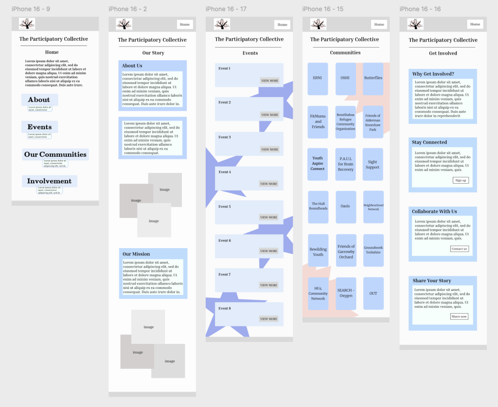
Final Designs – Mobile Version:
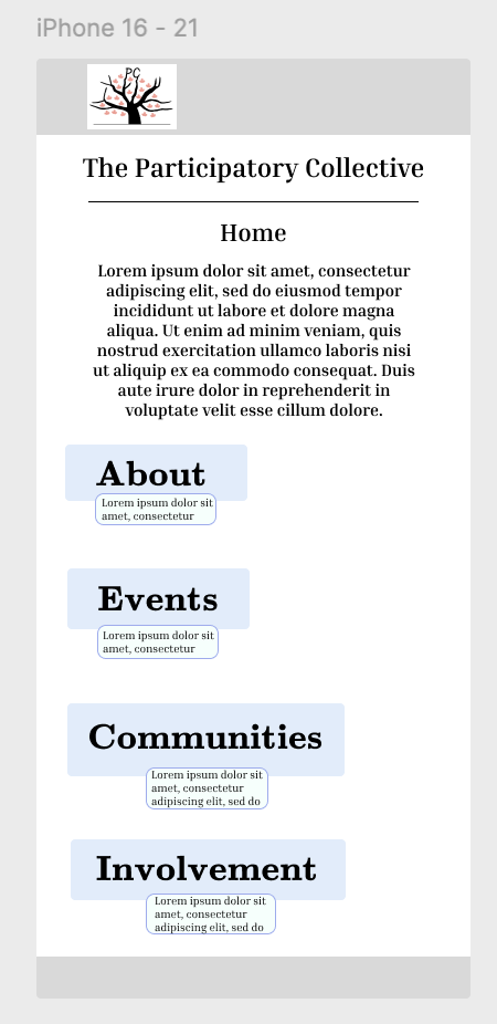
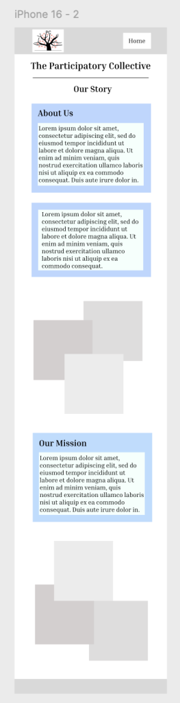
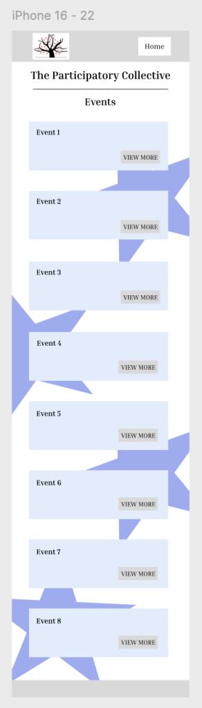
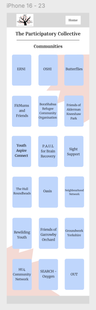
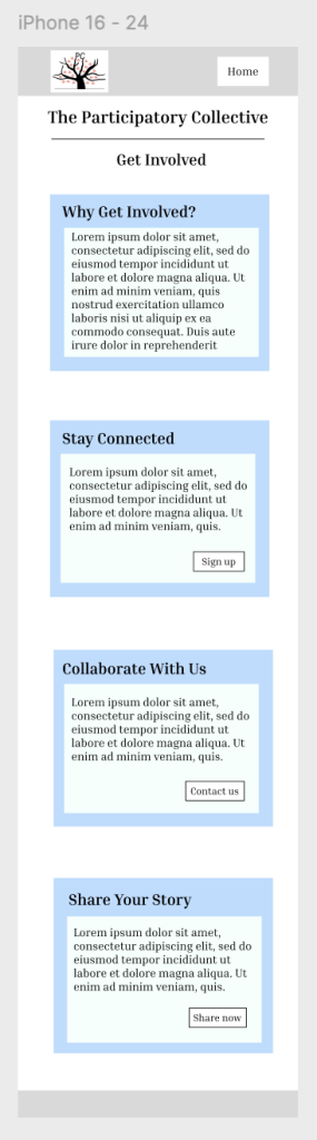
In this version of my design, the navigation is structured as a simple vertical menu, which creates a clear and approachable entry point for users. By placing the ‘Home’, ‘About’, ‘Events’, ‘Communities’, and ‘Involvement’ options in a stacked layout, I believe this makes it easy for visitors to quickly understand the different sections of the site without feeling overwhelmed. The content on each page is arranged in a clean structure, guiding users to scroll naturally down the page to uncover more information. The placement of text blocks followed by images helps the storytelling to have a calm reading flow, which suits a community-focused platform. The ‘Events’ page uses repeated ‘View More’ buttons to create a predictable pattern that makes navigation straightforward, and the ‘Communities’ page is organised into a tidy grid that invites exploration without clutter. I believe these things combined have created clear pathways, for example users can start at Home, learn about the collective, explore specific groups or upcoming events, and finally be encouraged to engage through the Involvement page. Overall, the layout choices support easy movement, minimal confusion, and a clear sense of progression throughout the site.
Desktop Version:
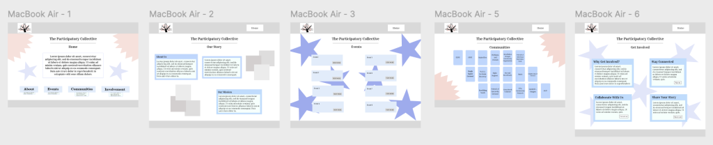
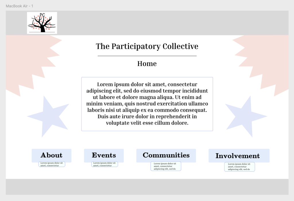
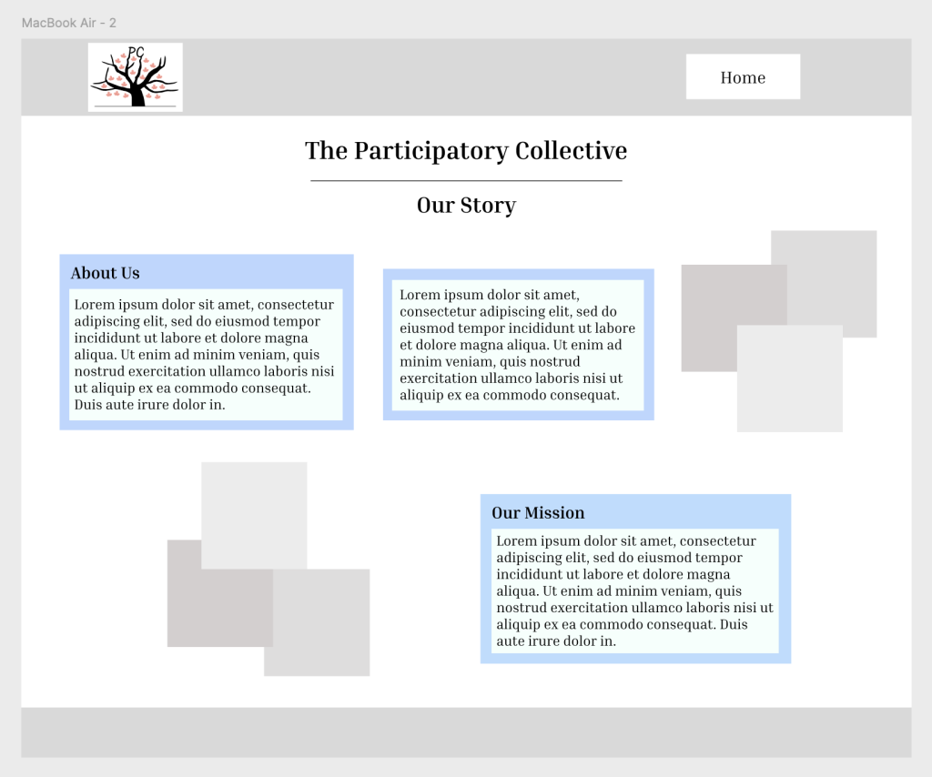
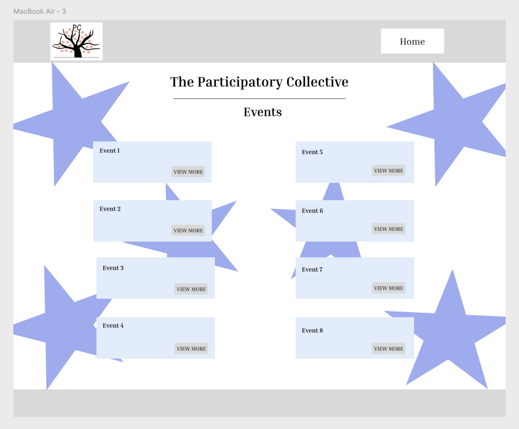
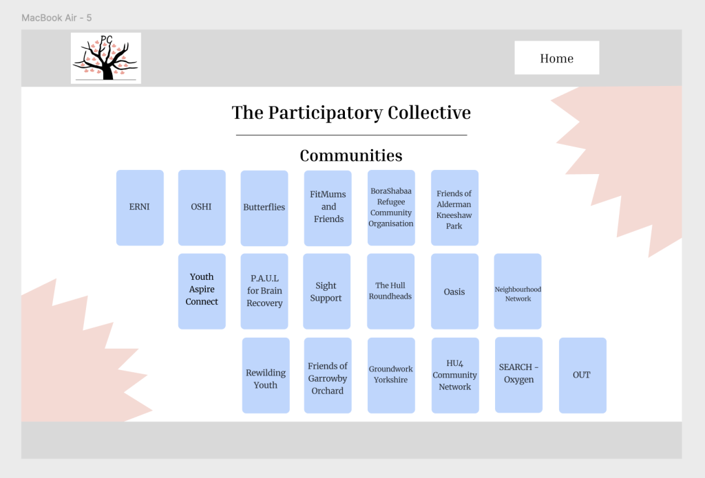
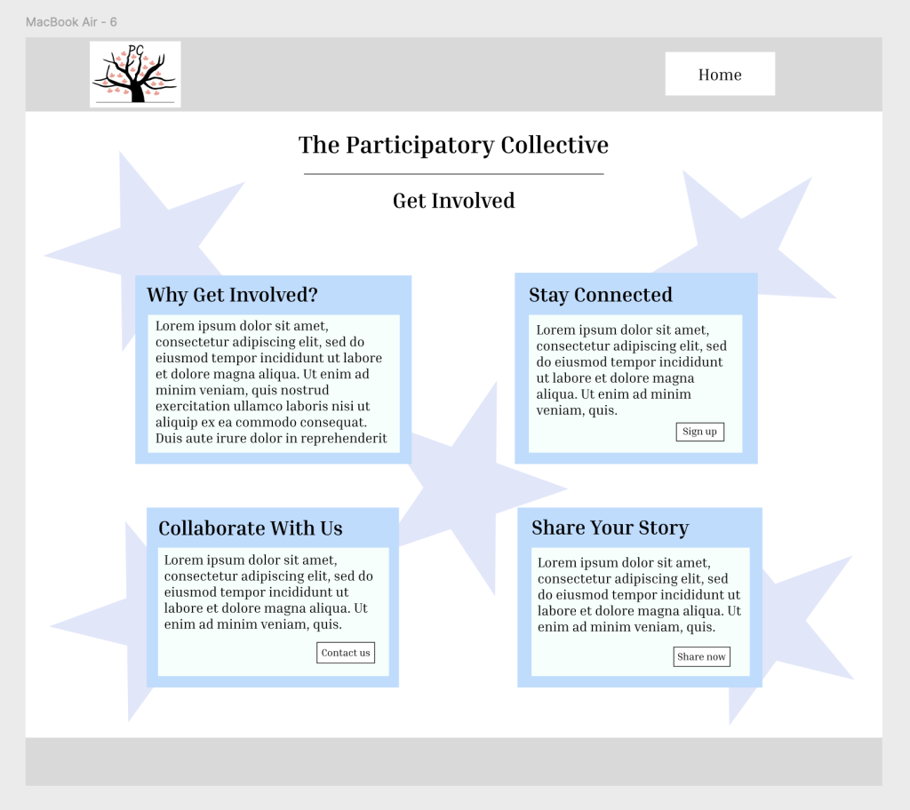
To ensure my site worked for a desktop, I had to expand the structure, reorganise layout, adjust spacing/typography, and change navigation patterns, to ensure the content adapts smoothly to larger screens. The navigation in this desktop design is structured to give users a clear, consistent path through the site, with the main menu positioned prominently at the top of each page so visitors can quickly understand the site’s layout. I believe placing the ‘Home’, ‘About’, ‘Events’, ‘Communities’, and ‘Involvement’ links in a fixed, predictable location reduces confusion and lets users move between sections effortlessly. Each page also mirrors the same visual appearance, the logo in the top left anchors the brand identity, the page title is centred for immediate clarity, etc. The buttons such as ‘Learn More’, ‘Join Now’, or ‘View Event’ are placed directly beneath or beside relevant text blocks, creating obvious next steps and encouraging forward movement through the site. This creates a consistent flow. Moreover, this layout establishes natural routes, users can either follow the top menu for primary navigation or use the buttons on each page to dive deeper into specific areas. The consistent use of space, alignment, and repeated shapes also subtly guides the eye from one content block to the next, reinforcing a smooth and predictable user journey.
Highlighting points of Desktop & Mobile Version:
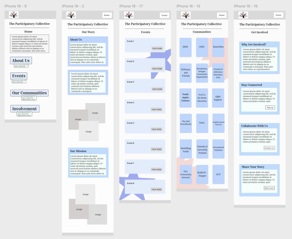
In developing my mid-fidelity prototype, I began shaping a visual direction that feels approachable, calm, and community-focused. Even though mid-fidelity doesn’t focus on final colours and detailed elements, I started defining a visual structure that supports clarity and warmth. I focused on clean spacing, consistent alignment, and simple shapes so that users can scan content without feeling overwhelmed. The limited colour palette used at this stage help highlight navigation. My aim is to create a visual environment that feels friendly and inclusive, reflecting the values of the community groups the website will represent for the Participatory Collective. Essentially, these early visual choices lay the foundation for later refinements in the high-fidelity stage. Throughout the design process, I consistently returned to accessibility as a guiding principle. Many community members may have different digital skills, so I felt the interface needed to be very readable, clearly structured, and supportive. I used large tap areas, uncluttered layouts, and consistent visual symbols to make the mobile experience more forgiving and easier to navigate. I also ensured that sections were broken into manageable blocks, helping reduce confusion. These decisions support a more inclusive experience that welcomes users with varying literacy skills, attention levels, or digital confidence. Designing for a community-centred project also means considering ethical and sustainable practices. I made intentional decisions to keep content concise and reduce unnecessary imagery, which supports faster loading and lower digital energy consumption. Another important part of my design process has been refining the overall visual language of the prototype. Even though this stage focuses on mid-fidelity rather than final designs, I still needed to make early decisions about layout consistency, spacing, and structure. Establishing a simple visual structure at this point helped me understand how information would feel when presented on a small mobile screen, and it allowed me to check whether the navigation and user flow were strong enough and whether they could move through the prototype effortlessly and without hesitation. Additionally, another area I reflected on was how the visual flow of the pages affects the user’s experience. For example, alternating between text blocks, buttons, and section breaks helps prevent any confusion and gives the user natural moments to pause and gather themselves. Even small details, such as keeping elements consistent or ensuring that touch targets are large enough, contribute to a smoother mobile experience. These considerations are especially important for community focused audiences, where users may have varying levels of digital experience. Essentially, by creating a calm, structured layout, I’m aiming to make the design feel approachable and supportive, rather than overwhelming and overly-structured. Lastly, another area I reflected on was the emotional tone conveyed through my design. As the project is based on community stories, shared experiences, and collective values, it felt important that the design did not come across as corporate or detached in any means. Instead, I aimed for a sense of warmth and openness by prioritising clean layouts, gentle spacing, and clear pathways. A welcoming site is essential and my main priority. Even without final colours or imagery, the mid-fidelity prototype still needed to convey and express a sense of this. Ultimately, this helped to guide decisions, such as placing introductions towards the top of key screens, providing straightforward CTA moments, and ensuring that users always know where they are within the flow design.