Early Sketches:
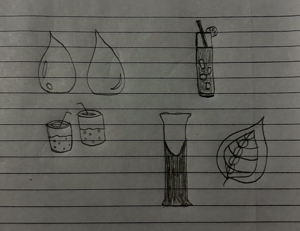
I believe my early logo sketches are strong early concepts with clear liquid and natural themes. The droplet shapes are eye-catching, while the glasses and bottle I was more exploring with. I’ve also included a leaf to link to eco-friendliness, and a quick demonstration of one of my drink mix powders. I have faith that simplifying and refining one strong symbol will certainly improve a logo design.
Visual References:
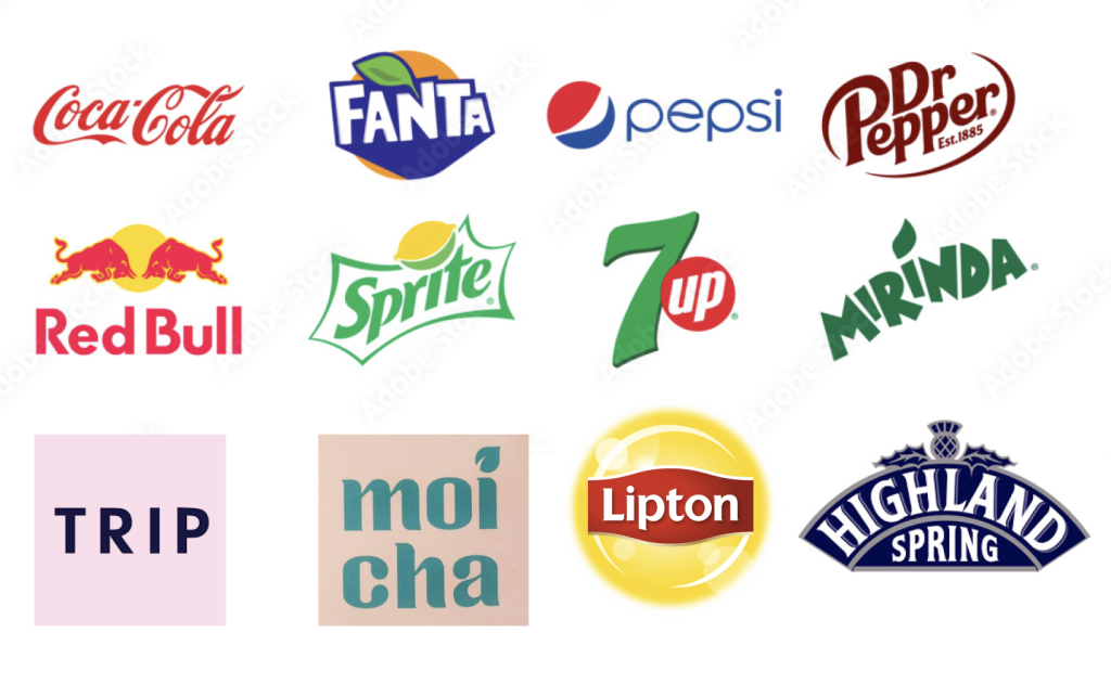
I also gathered some visual references that demonstrate my research into existing logos that align with my creative approach. This helps communicate my influences and design reasoning, by gathering inspiration.
First Logo Concept in Digital and Print:
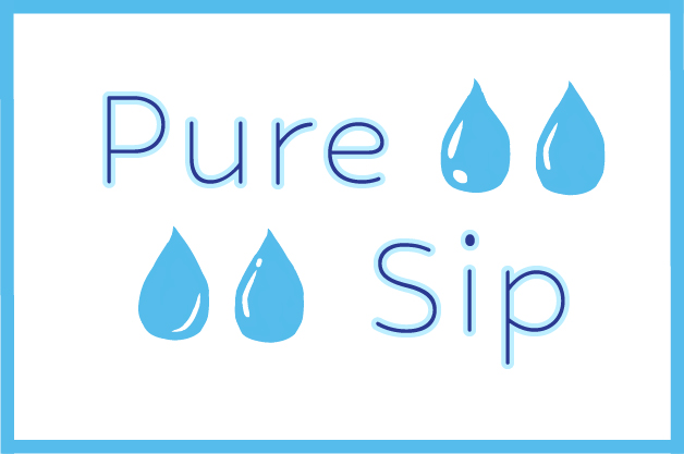
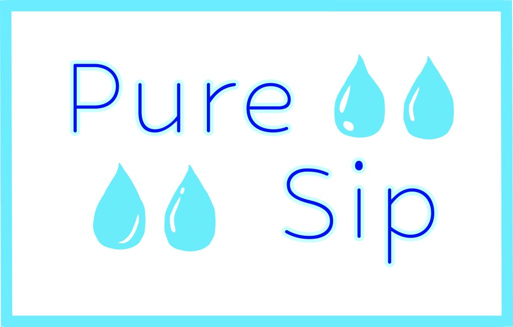
The logo on top is the print version in CMYK colour mode and the one underneath is the digital version in RGB colour mode, which is much more brighter and vibrant. I believe this version of a Pure Sip logo is clean, simple, and effective. The readability is strong due to the clear, sans-serif rounded typography, making the brand name easy to read across digital platforms and physical materials. The use of water droplet icons and a light blue colour palette communicate purity, freshness, and hydration.
Second Logo Concept in Digital and Print:
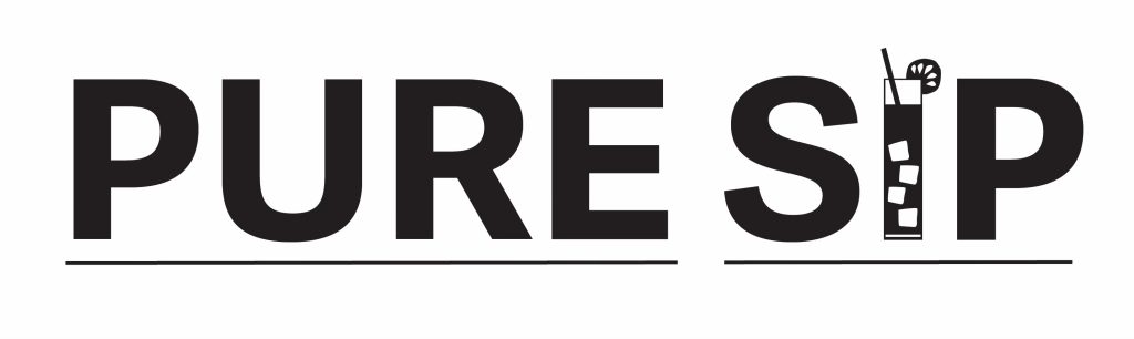
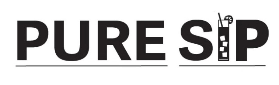
The logo on top is the print version in CMYK colour mode and the one underneath is the digital version in RGB colour mode, which looks fairly similar for a black & white design. This Pure Sip logo is highly legible due to its bold, clear sans-serif typography, making it easy to read across digital and physical formats. The most intriguing element is the drink glass icon integrated into the text, clearly representing a beverage brand. I believe the simplicity of this design is effective.
Third Logo Concept in Digital and Print (Chosen Logo):
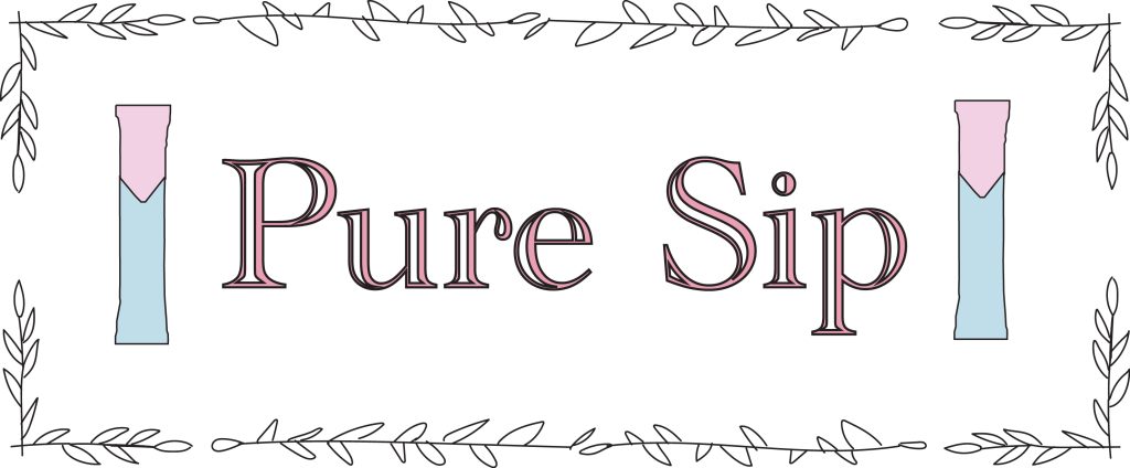
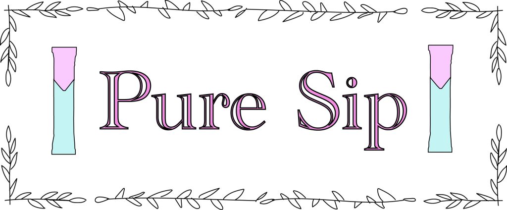
The logo on top is the print version in CMYK colour mode and the one underneath is the digital version in RGB colour mode, which is much more vibrant and colourful. This is my chosen logo for Pure Sip, which means my colour palette may become slightly more pastel, but still including the occasional brown tones to link to eco-friendliness further. Moreover, I believe the logo has good legibility through its clear serif typography, which remains readable in both digital and printed formats. The font I used was Academy Engraved LET Plain:1.0. Moreover, the logo design has a soft pastel colour palette and minimalistic illustrations of my drink mix powder product, suggesting a crafted beverage experience which reflects the brand. Lastly, the decorative border and refined style give the logo a distinctive, elegant feel, helping it communicate brand personality whilst still being a recognisable element of the brand’s visual identity. Ultimately, I believe this logo design is aesthetically pleasing with an even amount of space to avoid overcrowding.