Pencil Wireframes:
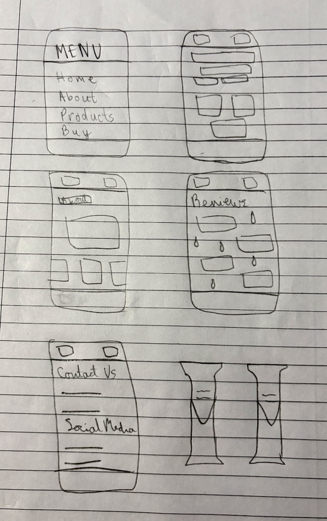
Before my digital layouts, I have created some pencil wireframes. These initial pencil wireframes and sketches clearly show some basic ideas for the user journey of the website. Each screen has a clear purpose, such as browsing products, reading reviews, or contacting the brand etc, which supports good usability. The layouts are simplistic, allowing space for key content to be added later. Ultimately, I believe they provide a strong foundation to develop into low and mid fidelity designs whilst having a user-friendly experience.
Two Rough Digital Layouts:
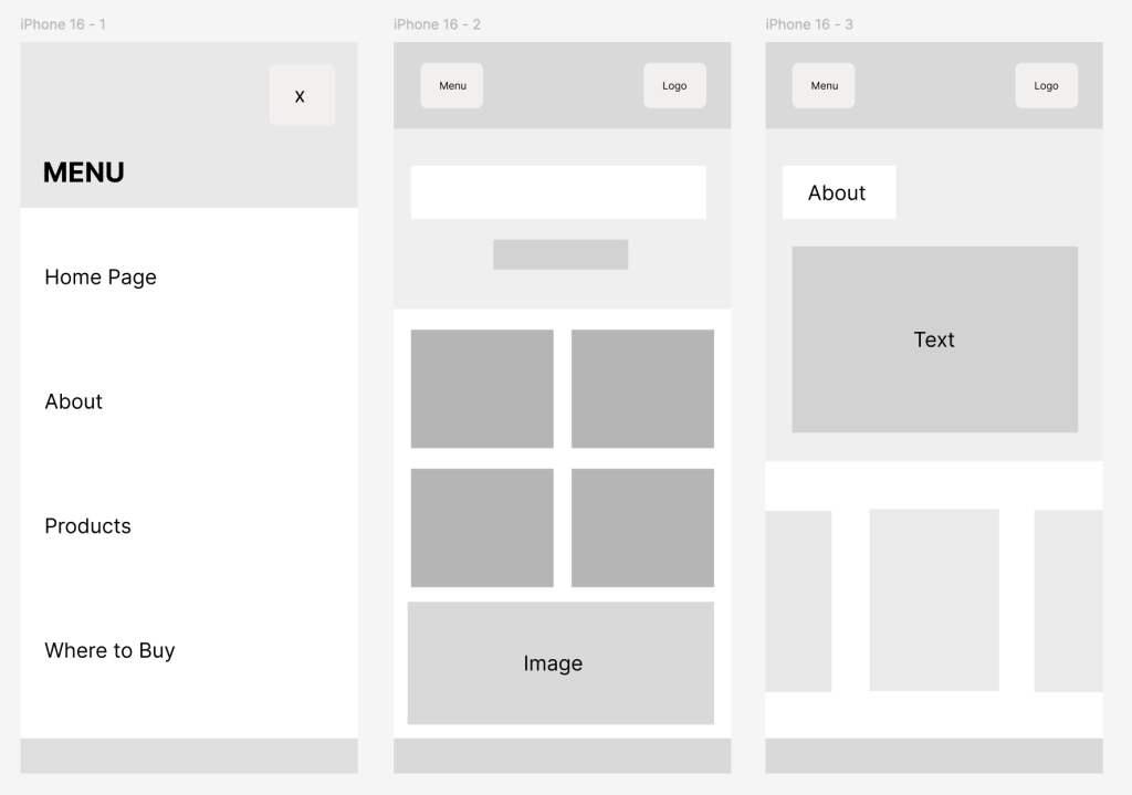
These are my low-fidelity designs which I believe benefit the company by focusing on simplicity, which supports a positive user experience for the target audience. The layout is minimalistic, making it easy for users to navigate the pages such as ‘Home Page’, ‘Products’ etc, which helps guide them. This approach suits an eco-conscious audience who value straightforward design. From a UI perspective, the clear menu placement and structured content blocks improve readability and visual hierarchy. From a UX perspective, the flow between pages allows users to move through the site easily without confusion. Overall, this design approach supports the brand’s goal of encouraging engagement and promoting sustainable products.
Final HQ Example (Mid-Fidelity):
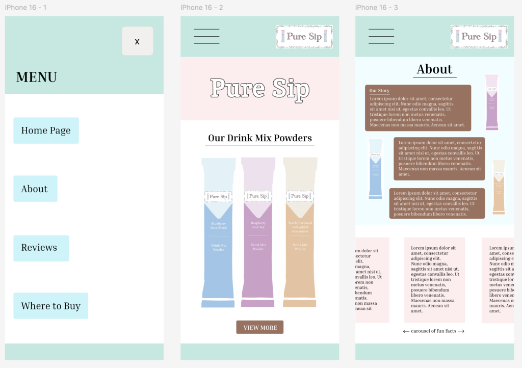
This is my mid-fidelity design for Pure Sip which I really enjoyed creating as I’m fond of mid fidelity. “Mid fidelity strikes a balance between low and high fidelity, providing enough detail for testing without unnecessary intricacies.” (Figure 1) I’ve included more detailed elements to showcase the brand such as illustrations of the products, incorporating colour, serif fonts etc. This design benefits the company’s agenda by combining clear UI design with UX, tailored to a eco-friendly and mobile audience. Moreover, from a UI perspective, the use of more soft pastel colours, consistent typography, and clean layouts creates an aesthetically pleasing and clear interface that reinforces the brands trustworthy identity. From a UX perspective, simple navigation, a clear menu, and a vertical scrolling structure makes it easy for users to explore products and information efficiently. Ultimately, together I believe these design choices improve usability, encourage engagement, and support Pure Sip’s overall brand and business goals.
Reference List:
Figure 1: Traylor, L. (2024) What Is Prototyping and Why Is Mid Fidelity Its Unsung Hero in Rapid Testing? https://thegood.com/insights/what-is-prototyping/ [Accessed 14 Jan 2026].