Link to my Figma Design File:
Overview of the High-Fidelity Design:
Link to my Figma Design File:
Overview of the High-Fidelity Design:
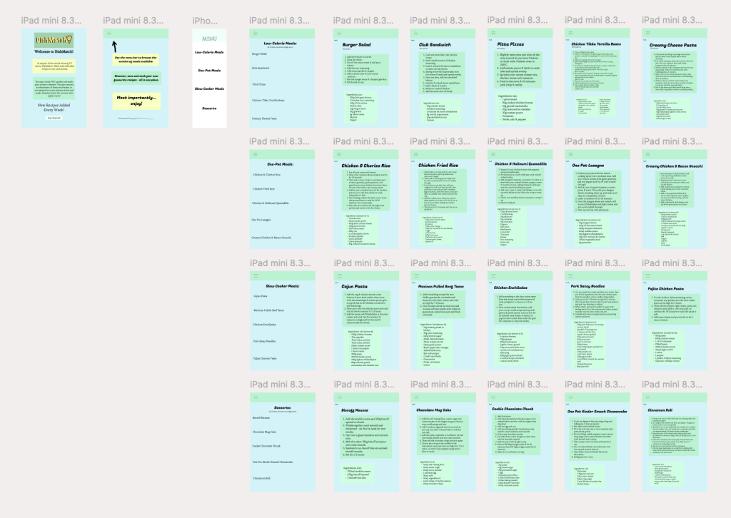
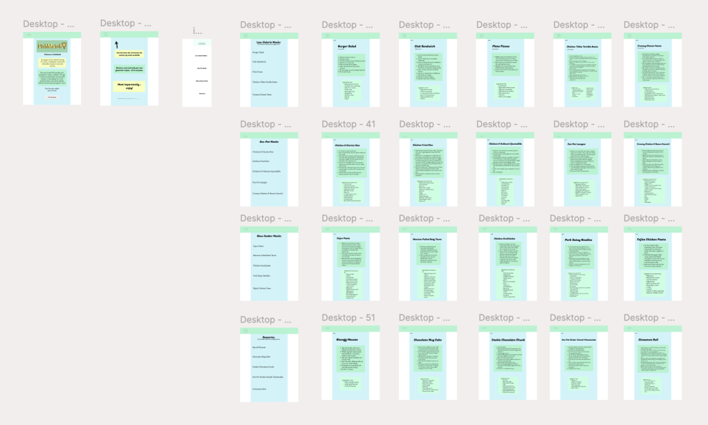
This is the tablet and web-based version of the companion application. I believe the design fits these formats effortlessly and pleasingly. This is due to responsive layout. A responsive layout is a design approach where the app or website automatically adjusts to look and work on any screen size. This means my content is flexible and adaptable with just some minor adjustments. For the web-page design, I’ve enlarged the content and added two white columns either side of the design. This allows it to fit the apps dimensions and vibes as much as possible. I also placed the menu header/bar across the whole width at the top of the page, this helps to utilise the space and it is an important element of the design. For a good website you have to ‘be sure you understand their needs and what they want to achieve when they search for your page.’ (hotjar, 2024). This is achieved by the clearly organised different categories of meals and recipes available. Moreover, for adjusting to the tablet design, I simply enlarged enlarged the design, making for a very pronounced experience. These two designs are clear and usable everywhere, which is essential as everyone uses different devices to access things. For example, larger devices such as these may be better for some for kitchen use. They have a larger screen which makes it easier to follow recipes while cooking. It can be propped up like a cookbook, making hands-free usage easier. A web-page also means you don’t need to download an app as it’s accessible on any device with a browser. Ultimately, I believe these designs work effectively for the use of a recipe app for DishMatch.
Reference List:
square, C. (2024) What Makes a Good Website: 6 Things You Need to Know. https://www.hotjar.com/web-design [Accessed 17 May 2025].