Link to FigJam Board:
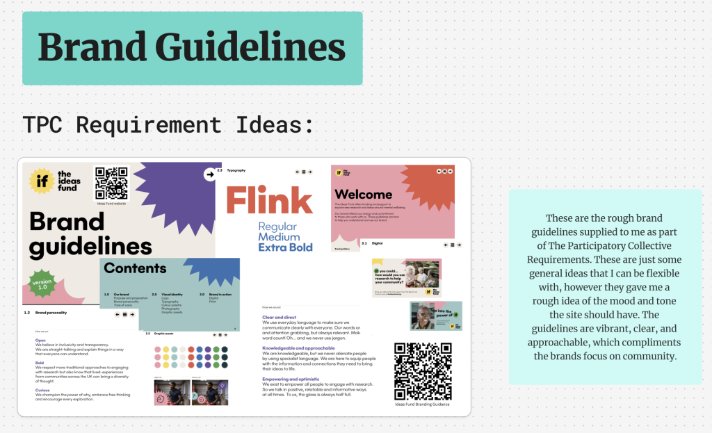
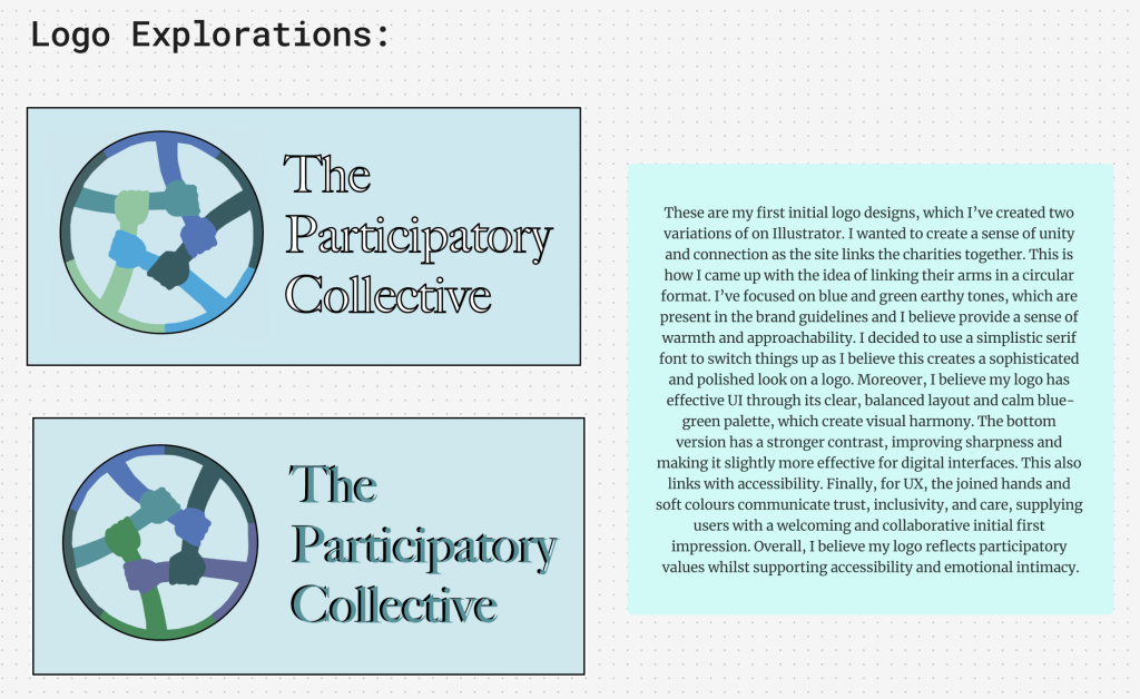
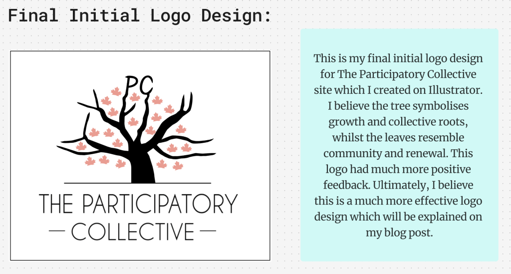
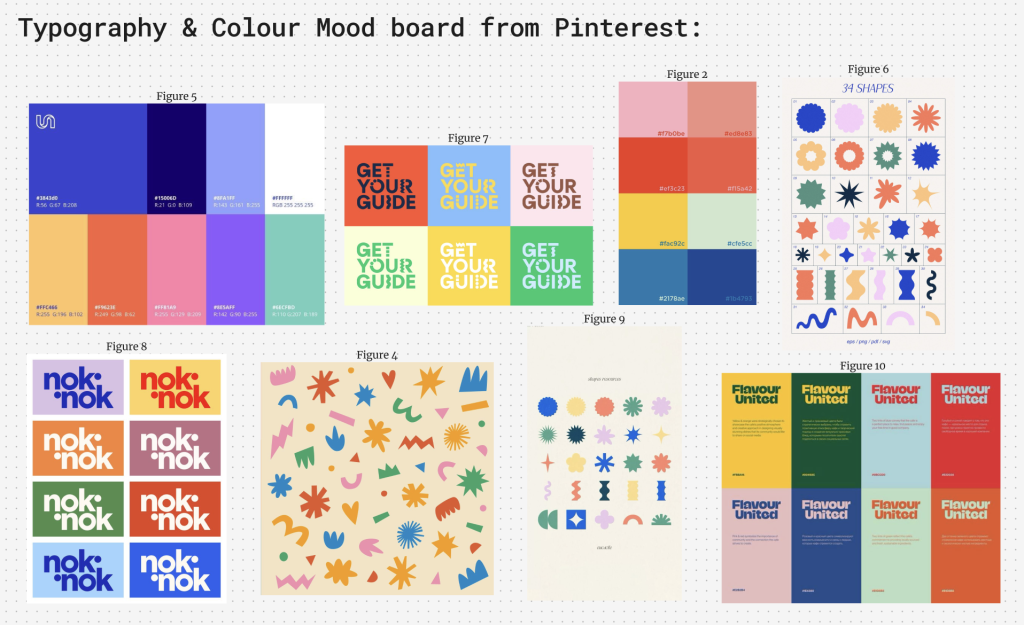
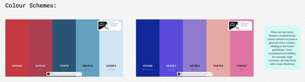
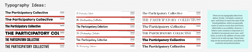
This page focuses on the development of The Participatory Collective’s brand identity, combining research, experimentation, and refinement. The initial inspiration came from existing brand guidelines and a Pinterest mood board I created. Firstly, the early logo explorations experimented with circular and symbolic designs highlighting community and growth. However, the refined final logo has a different tone which represents roots and renewal. In addition, the two colour schemes were created to balance warmth and clearness, whilst ensuring accessibility. Moreover, various typography trials explored readability and tone. Additionally, with further research, I really enjoy the WWF World Wide Fund for Nature site (Figure 11), due to its smoothness on the site, use of professional colour scheme and sans-serif fonts. This is a site I’ve definitely taken inspiration from. Overall, this page demonstrates a considerate, researched branding process focusing on inclusivity and visual unity.
These are my final colour palettes I decided on. I believe these create a balanced sense of warmth, expression, and vibrancy. These colours also add a sense of positivity, without appearing overly bright and childish, which isn’t the tone of The Participatory Collective site.
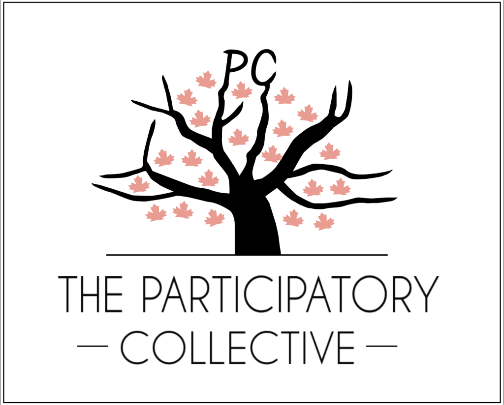
This is my final initial logo design which I believe is more effective and aesthetically pleasing than my original attempts. I knew I wanted to include ‘PC’ within something real, which is how I ended up with this idea. The logo includes a tree to represent growth and connection, which is effective when representing different community groups. The branching form suggests inclusivity and shared purpose, while the red leaves are made to symbolise the individual voices contributing to a collective whole. Incorporating UI and UX, the design is clean, balanced, and adaptable across different digital platforms. Its simple colour palette and clear use of typography make it highly distinguishable and scalable for different types of screens etc. Moreover, I have considered accessibility, for example, the high contrast between the black and white elements helps with readability, especially for users with colour vision impairments. Finally, I believe this logo effectively communicates inclusivity and engagement, whilst maintaining a strong logo design.
Reference List:
Figure 1: Coolors (2018) Coolors. https://coolors.co [Accessed 23 Oct 2025].
Figure 2: Creative Co., M. (2019) Bright, Punchy, Vibrant Color Palette #branding. Pinterest. [Photograph]. https://uk.pinterest.com/pin/545920786081722569/ [Accessed 23 Oct 2025].
Figure 3: Dafont (2019) DaFont – Download fonts. https://www.dafont.com. [Accessed 23 Oct 2025].
Figure 4: Design, Z. (2024) Patito – ZigZag. [Photograph]. https://hellozigzag.com/patito-3/. [Accessed 23 Oct 2025].
Figure 5: Dribble (2025) Unbabel Palette. [Photograph]. https://uk.pinterest.com/pin/503769908331660815/ [Accessed 23 Oct. 2025].
Figure 6: Market, C. (2025). Retro Abstract Vector Shapes. [Photograph]. https://uk.pinterest.com/pin/258394097364488205/ [Accessed 23 Oct 2025].
Figure 7: Motta, A. (2025) Colorful Library Branding. Pinterest. [Photograph]. https://uk.pinterest.com/pin/4574037117529710/ [Accessed 23 Oct 2025].
Figure 8: nok, nok (2025) Established. [Photograph]. https://noknokstudio.com/studio [Accessed 23 Oct 2025].
Figure 9: Ntokie (2025) shapes resources • eucacile. Pinterest. [Photograph]. https://za.pinterest.com/pin/803400021066726341/ [Accessed 23 Oct 2025].
Figure 10: Pinterest (2025) Pinterest. [Photograph]. https://uk.pinterest.com/Thedesigntime/_created/ [Accessed 23 Oct 2025].
Figure 11: WWF (2024) We are WWF. https://www.wwf.org.uk [Accessed 23 Oct 2025].
Screenshots of work in case embedded link fails: