(Figure 1)
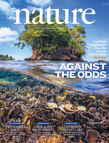
This is a good example of the use of composition on a nature magazine cover which I have selected. I enjoy the composition of this, as it’s easy for us to understand what we’re looking at and is aesthetically pleasing. The process of composing, specifically the arrangement into specific proportion in artistic form is an important part of designing, which I believe has been pulled off throughout this magazine cover. The tree is placed centrally of the image, which is also known as having a central composition. This captures our attention and is the most powerful way to draw attention to a subject. The water flowing through the middle of the image is lightly blurred so there is some text placed on top of this, allowing it to stand out, also with it being in the middle centre of the image. It makes our brains automatically want to read this part of the cover straight after reading the title of the magazine, due to it standing out so much. Furthermore, the coral at the bottom of the image is full of detail and adds some colour. The quality of the coral and the tree enhances the blurriness of the water in the middle of the image, drawing our attention to it. This is important as this is the main focus of the magazine. Millions of people and species of wildlife depend on coral reefs. While climate change threatens their future, science shows that corals will be able to adapt and survive, only if we keep them healthy (Figure 2). Ultimately, the arrangement of this magazine cover is simplistic but well thought out. The composition isn’t overly busy or complicated, and doesn’t make our eyes wander in loads of different directions. It has a minimal amount of components but they have been displayed carefully, utilising the composition of the cover. This creates for a pleasing magazine cover.

(Figure 3)
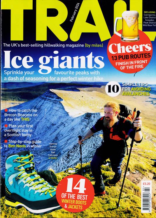
This is a bad example of the use of composition on a nature magazine cover which I have selected. I find the whole cover very confusing, overwhelming, and busy. The main image is even at a confusing angle at an odd height and the man has almost just been placed there randomly, very close to the front of the image. Moreover, there is some images of subjects placed around the images which look very out of place, such as a trainer and a beer. I believe they have just been placed at random and they often cover parts of the composition. For example, the beer covers half of the letters in the title which is ‘Trail’. I believe everything has just been sort of randomly placed without method, there is parts of writing, bubbles of text etc, just placed without thought. The title is even cut off at the top of the cover. Parts of and texts and information are often unclear to read due to what it is placed on top of. Moreover, the whole composition is too busy and contains too many bright colours that don’t work together in this instance. The purpose of this cover is to encourage walking, but I believe this cover won’t encourage many to do this as it looks too confusing, therefore doesn’t get it’s point across and doesn’t make us want to read further. Ultimately, It looks messy and overly complicated, making the viewer uninterested.

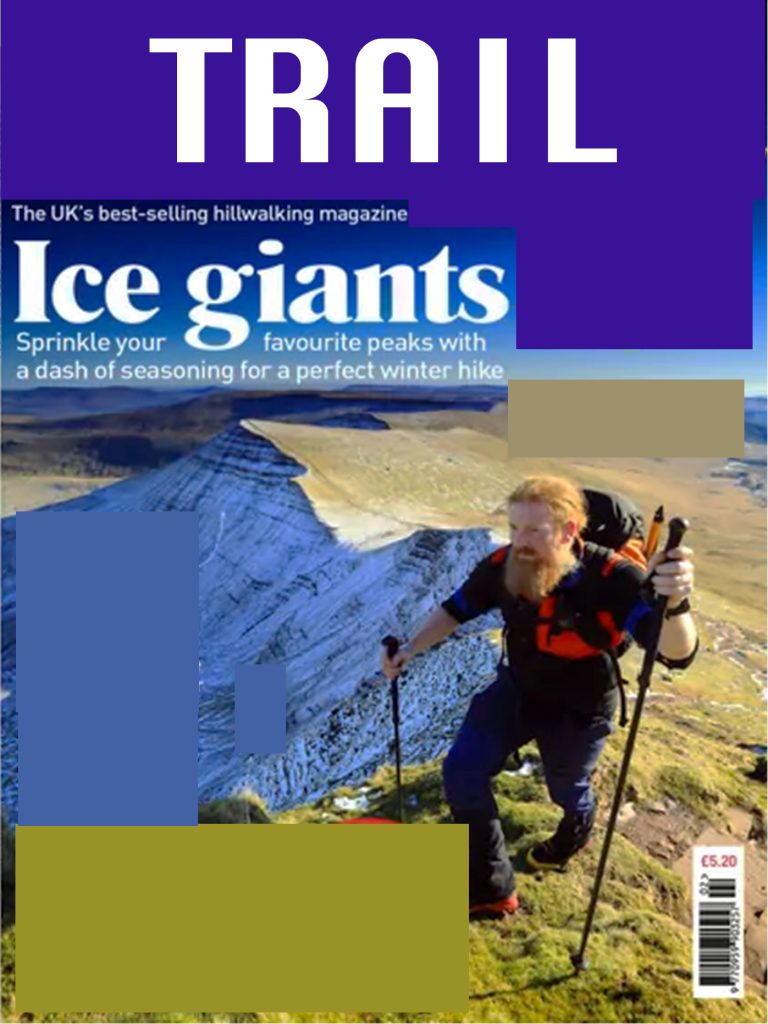
This is my redesigned demonstration of a refined example of the bad magazine cover. As well as with the typography design, the blocks of colour are where the original image would be placed. I decided to reduce the amount of text and eliminate the beer and shoe subjects, as I felt these things really complicated the composition and that it really needed reducing, as it wasn’t necessary. I also changed the font of the title as it was taking up the entire top part of the magazine cover, with no negative space around it, so I knew that needed to be made smaller. Moreover, I believe the original image needs re taking to improve the composition but obviously I can’t do that, so instead I settled for changing the brightness and saturation of the image to look much more natural, which I think compliments this design. Overall, I believe these changes have allowed for a much more arranged cover that is much more clear, making us want to read further.
Reference List:
Figure 2: Coral Reef Alliance. (2023) We believe in coral reefs. https://coral.org/en/ [Accessed 30 October 2024]
Figure 1: Nature. (2016) Nature – Volume 535 Issue 7612, 21 July 2016. https://www.nature.com/nature/volumes/535/issues/7612 [Accessed 9 October 2024].
Figure 3: Newsstand.co.uk. (2014) TRAIL. https://www.newsstand.co.uk/144-camping-walking-climbing-magazines/13063-subscribe-to-trail-magazine-subscription.aspx [Accessed 9 October 2024].