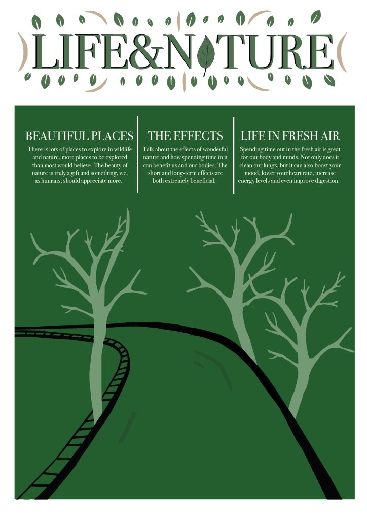
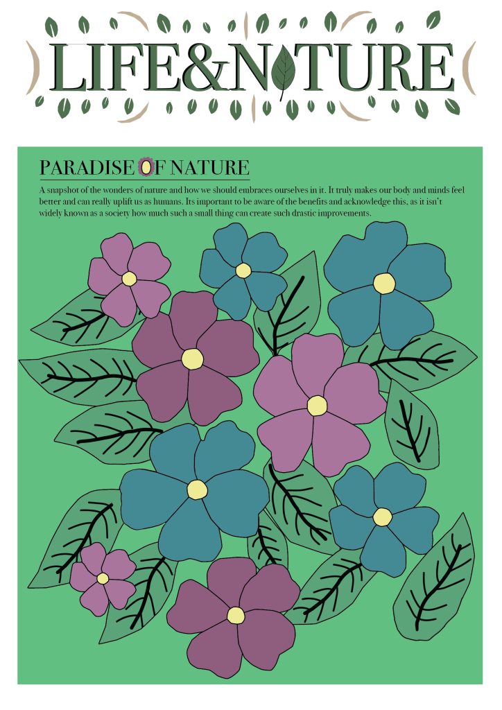
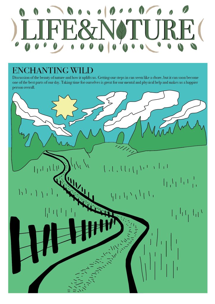
These are the cover designs, adhering to the brand standards. I really enjoy the illustrations and composition to highlight the logo which these all have. I ensured to include at least two shades of green within each design to tie in with the logo at the top, which creates an example of tonal variation, and I think the masthead compliments each of these designs. To begin with, the first cover design is the darkest one, consisting of an isolated path amongst trees. I chose to make the background a dark shade of green, similar to the forest green shade in the logo, which automatically allows the piece to tie together effortlessly. I kept solely the fill colour of the elements, without an outline, to keep it simplistic. I enjoy the fact this design has lots of negative space, allowing it to not become overly cluttered and creates an easy viewing experience. I think this easily gets the point across about how it’s based around nature. This is perfect for my target audience of young adults to quickly provide them with an overview of information without having to read into too much. I also believe including a snippet of the information inside is crucial for the cover design, so I have included this context within three small paragraphs as well. Moreover, the second design has a busier composition which is an arrangement of flowers which I have created. These pops of colour of blue and pinks create an exciting and dynamic focal point, without overpowering the whole composition. I’ve also included a small paragraph to inform the reader as I felt this was necessary. Additionally, I decided to alter the letter ‘O’ in the subhead ‘PARADISE OF NATURE’ into a flower to tie in with the main design which I think has been achieved. I also included a brighter green background to create an overall more vibrant feeling to this. I believe this design looks effective and aesthetically pleasing. Finally, the last design is my favourite. It consists of a winding path with lots of grass, trees, clouds, and the sun. I enjoy the harsh edges and bold unrealistic shapes, not overcomplicating things but instead sticking to the basics which is sometimes what looks best. The different shades work together to create a positive and lively mood and voice, emphasising the mood of this magazine which is to encourage walking to boost happiness, as well as many other benefits alongside this. I’ve also added a small, but detailed segment of text to add context to the design. In addition, I’ve found the pen tool very useful without these designs, always allowing me to create freely and easily, however I want to. Throughout these designs, I took lots of inspiration from the ‘nature’ British weekly journals (Figure 1) which have inspired me throughout my works. My favourite one is the article based around Tree Dimensions, which is evident as I have included lots of trees within my designs (Figure 2). Ultimately, I feel these cover designs would entice a viewer in my target audience to open up the magazine and continue reading.
Reference List:
Figure 1: Nature (2019). Nature. https://www.nature.com [Accessed 8 Jan 2025].
Figure 2: Nature (2019). Nature – Tree dimensions. https://www.nature.com/nature/volumes/569/issues/7756 [Accessed 8 Jan 2025].