(Figure 2) – quotes
(Figure 1) – quotes
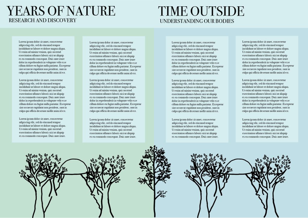
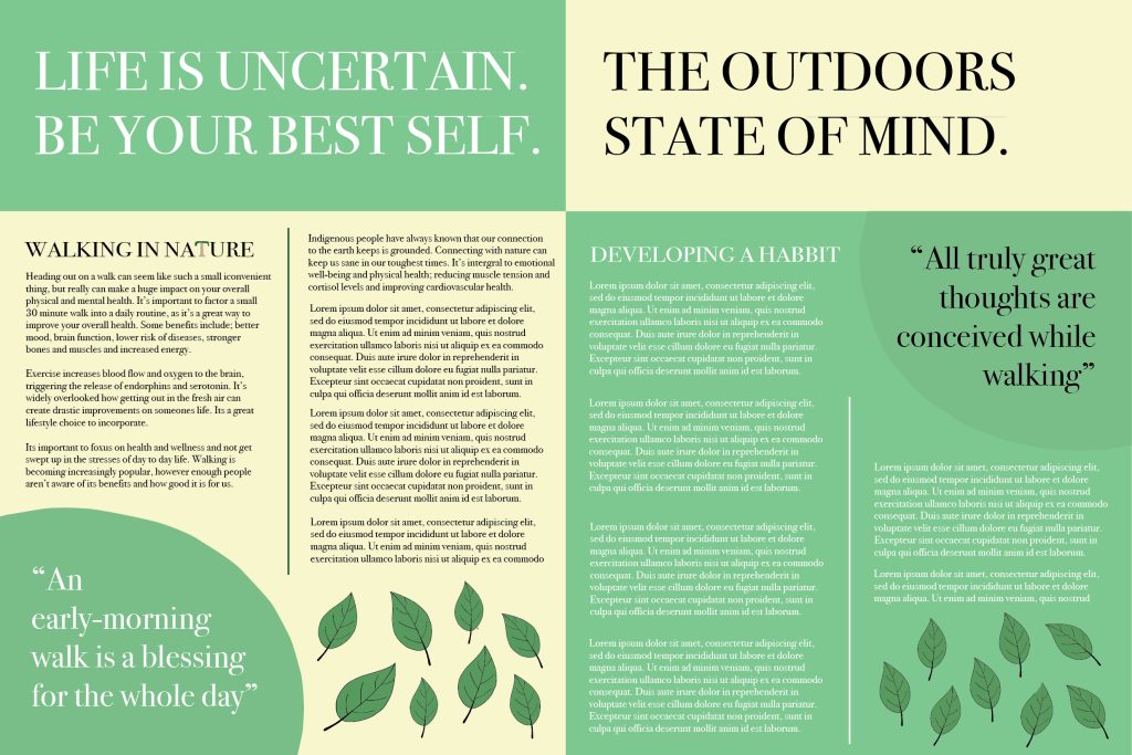
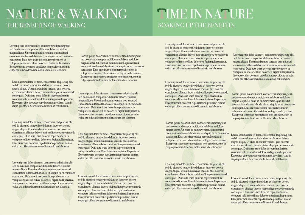
These are the traditional information pages, adhering to all of the brand standards. One the first pages, I decided to include a thicker highlighted section at the top containing just the headline, to give the start of the pages a bolder and clear start. The colour scheme is bright and colourful, consisting of a light shade of beige and a more vibrant shade of green, with some leaves I’ve created using the pen tool at the bottom of the composition. I’ve included some thin lines to separate the columns of text, as I enjoy this technique used within this type of media. I’ve also included some quotes in bubbles on the pages to inspire those reading even further. I also included a small element of conceptual design in the letter ‘T’ in the first subhead, but this is more evident in the second lot of pages in the headlines. In this I have altered all of the ‘T’s by creating a tree in the same shape. This is because I noticed this letter looked like the shape of a tree, so this was very simple to create using the pen tool. I think this looks very effective and draws our attention to the headline further, encouraging the viewer to read along. Another idea I had for these second pages was to take the leaves from the first pages and create a background, placing the leaves scattered around with a low opacity to create a detailed background effect. This enforces the theme of nature across the whole composition, therefore I didn’t do much else with these page designs as I wanted the background to be the main focus. Furthermore, for the third pages, I created another simplistic, yet sleek look, including some more pastel, muted shades of yellow and green. I’ve also included some more enlarged quotes across the bottom of the composition in a separate highlighted section, to further inspire the reader again. Lastly, for the final pages I wanted to create some more illustrations as I haven’t done many yet, but I think illustrations are a massive part of this type of media as a visual element creates for a much more dynamic appearance. Essentially, I decided to create a path with some trees and the sun rising, as I hadn’t created a path yet, which I think is necessary for this project to highlight where the steps should be taken. For this illustration, I just decided to keep the black outline instead of adding any fill colour, as I think just keeping the foundations of a piece is sometimes all that is necessary and that it can create a minimalistic, sophisticated look. I think this provides the outcome with a chic feeling. Additionally, I also included some more pastel green and blue shades to tie in with this simplistic feeling. Overall, I believe these designs create a cohesive harmony with a strong tone of nature and walking and encouraging us to push ourselves and spend more time soaking up nature.
Reference List:
Figure 1: Graham, D. (2024). 16 best nature quotes: our favourite sayings about the natural world. https://www.countryfile.com/wildlife/best-nature-quotes [Accessed 8 Jan 2025].
Figure 2: Wahlgren, K. and Wahlgren, K. (2023). 25 Walking Quotes to Get You Inspired. https://www.beachbodyondemand.com/blog/walking-quotes [Accessed 9 Jan 2025].