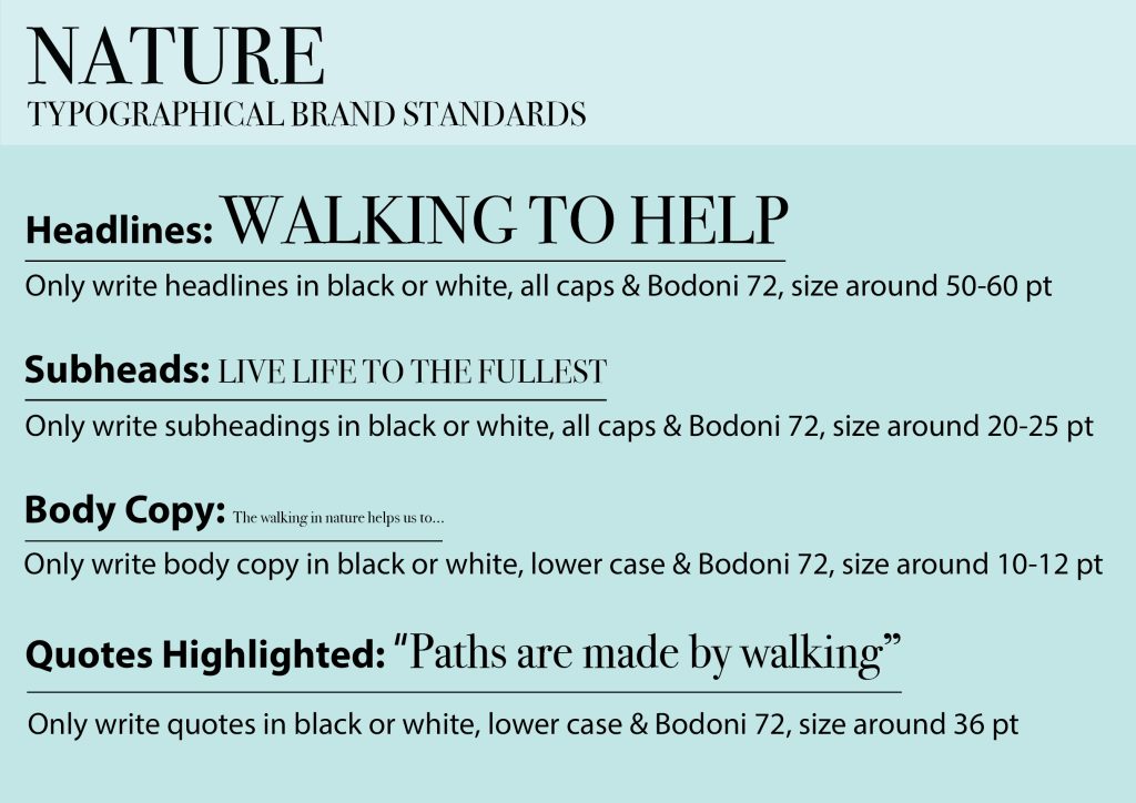
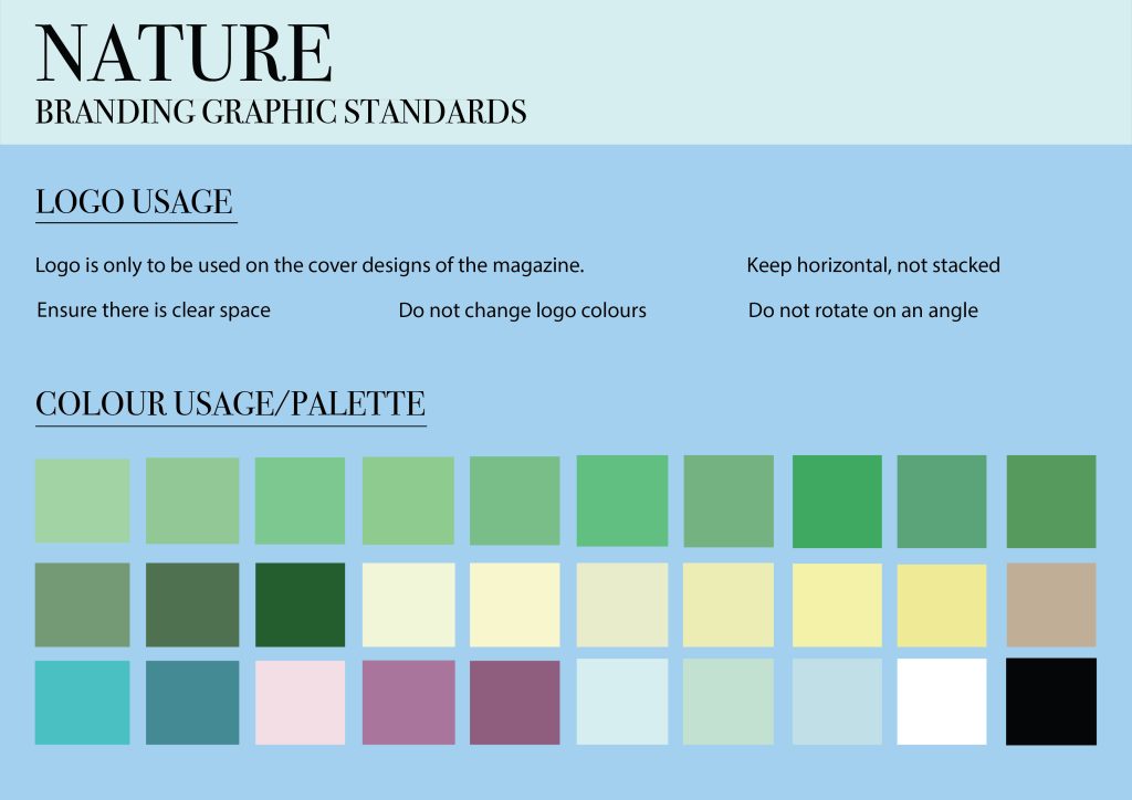
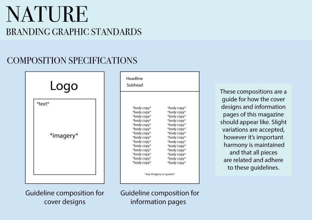
These are my branding graphic standards for my naturistic, walking, 2D Editorial Design, traditional print magazine project. My target audience is young adults, as I believe this age group can feel a bit lost on what to be doing with their life and can develop addictive behaviours with technology and social media. Therefore, I want to encourage walking and soaking up nature by showcasing all the benefits. To begin with, I have created the typographical graphic standards. I decided I only want there to be one typeface throughout this design and I don’t want to use any typeface variations, as I wanted to create a sleek and clean look. This meant the typeface I chose had to be universal, so I decided to use a sophisticated serif font called Bodoni 72. I wanted there to be a huge contrast between the size of the headline with the body copy, hence the 50-48 pt difference in size, so I worked around this to create the middle sizes for the subheads and quotes. Only the headline and subhead should be in caps, as this should be where our eyes are drawn to first. I also only want the type to be monochrome because I feel it helps the type grab our attention the most. Ultimately, I feel I have made these points clear in the brand standards by separating each different type form with gaps of space. Secondly, I focused on the logo and colour. I decided to move onto logo usage and where/how it should be used by demonstrating some clear statements. It’s important the logo isn’t altered in any way shape or form, as then it can lose its importance and make the brand look indecisive. The logo should only be used at the top of cover designs, so that it doesn’t end up overused and ensure that it holds its importance. Moreover, for colour usage I decided to create a colour palette, consisting of lots of green shades to tie in with the greenery of nature. I also included some more neutral shades such as beiges, as these will be useful in any design process. I also found it essential to include a range of blue and pink shades for creating aspects such as the sky and flowers. I created this colour palette by creating filled squares of filled colour. Finally, I created the final section of graphic standards which consists of composition specifications. I took lots of inspiration online and gathered my favourite compositions for this type of project. I wanted to create my own examples using labels showing how I want them to look. For the cover designs, I found it to be necessary that the logo has its own section, with the contents of the design in a separate section, hence I’ve decided to create a smaller separate boxed off part below the top of the composition, so the logo is highlighted by an isolated white background. I believe it’s essential to include some imagery on a cover design, to create a visual element of whatever the project will entail, so I have made that clear within the composition using labels. For the information pages, I wanted to make a separate boxed off section that will be a different colour across around the top sixth of the screen for the headline and subhead. This just allows us to clearly differentiate the sections and creates an aesthetically pleasing appearance. I’d also generally like the body copy to be placed in columns to create structure, only two on the left and right side of the page. Adding additionally imagery and quotes will also help create a cohesive piece. However, I felt it was important I allowed for variation within these compositions, otherwise it would get repetitive. To gather further guidance and knowledge on brand standards, I found some examples online which really inspired me (Figure 1). Ultimately, I believe these brand standards or guidelines define how the brands graphic elements should be used to help catch the target audiences attention.
Reference List:
Figure 1: Bicaku, E. (2022). 15 Brand Guidelines Examples to Inspire Your Brand Guide. https://looka.com/blog/15-brand-guidelines-examples-to-inspire-your-brand-guide/ [Accessed 8 Jan 2025].