Moodboards
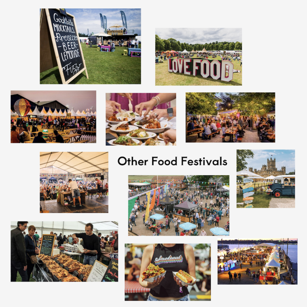
This is a mood board of other food festivals from google. This allowed me to gain inspiration and ideas to include at the festival. It includes lots of ideas for signing, shelter, how to present the food, how to take the festival through to the evening, and more.
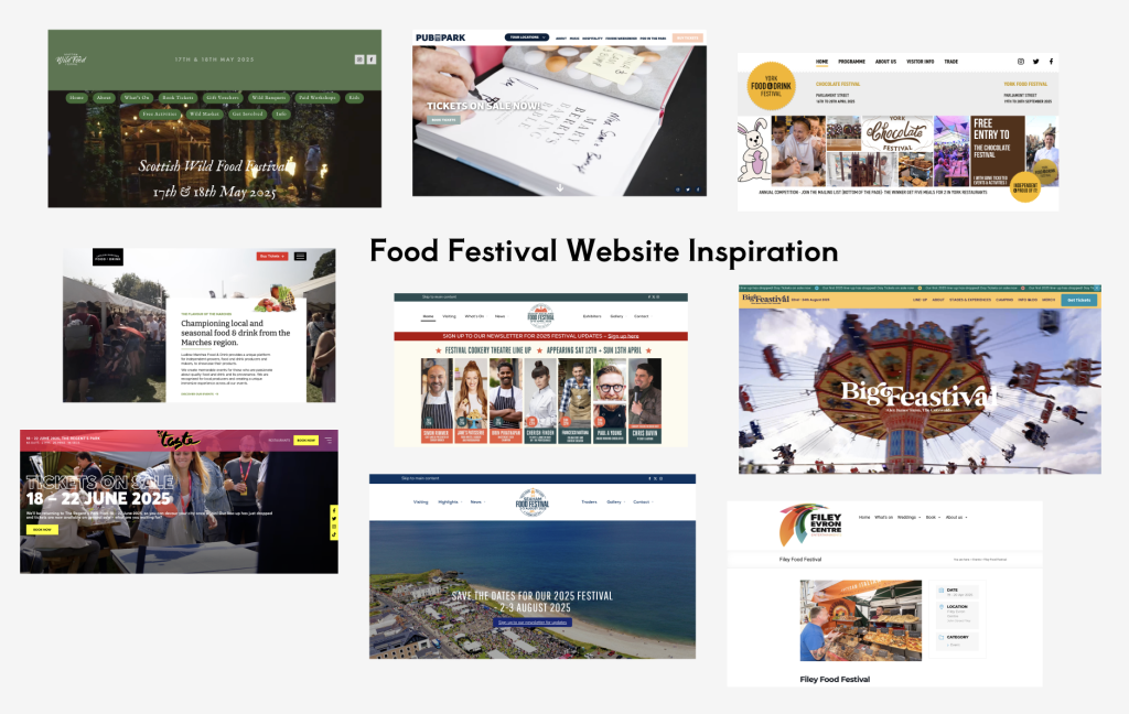
This is a mood board of food festival website inspiration from google. I think it’s important to look at other websites and I really liked all of these. They included lovely colour scheme with lots of intriguing images, enticing me to want to visit the festival myself. A few of the websites had elements I hadn’t even thought of such as a slideshow of images of what the festival will entail.
Typography
Fonts throughout App/Website
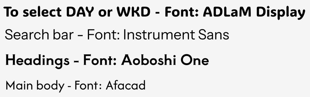
These are my fonts used throughout the app/website. I decided to stick with sans serif fonts, apart from the headings, to make the text as simple to read for those with dyslexia or sight problems. I also chose these as I think it gives the app/website a clean, sleek look. However, I still think the headings are clear as the headings are more bold than the main body of text.
Fonts in Logo
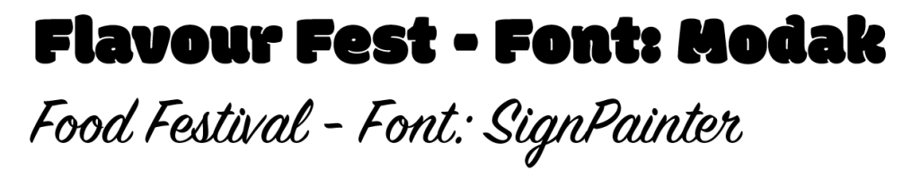
These are my fonts used in the logo. I wanted to switch things up and use serif fonts, however I still think these make for a clear logo. A website actually argues that ‘the serif makes the individual letters more distinctive and easier for our brains to recognise’ (threerooms, 2019). The main part of the logo that says ‘Flavour Fest’ is a bold, thick, and bubbly text so it captures the viewers attention. For the smaller ‘Food Festival’ text underneath, I used a more cursive font to create a contrast within the logo. I think these opposites compliment each other. Moreover, I also think it’s important these fonts are very different to the text throughout the app/website design, as it allows the logo to stand out further when present.
Colour
Colour Planning of App/Website
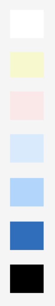
This is the colour palette of the app/website. I wanted there to be a range from light to dark shades. I wanted to use lots of tonal variation of blue as I think blue suits lots of colours paired with it, therefore the other colours I decided to incorporate were some light, gentle yellow and pink shades. Blue and yellow are complimentary colours on the colour wheel, so these already work well together, and pink is just one of my favourite colours which will only be incorporated a little bit throughout the design. I also found it to be essential to include black and white, mainly for text.
Colour Planning of Logo
This is the colour palette of the logo. These shades are fairly mutual, however I still think they managed to create a bold logo. I wanted the text to be all monochromatic blue shades to tie in with the main theme of the website, then the orange was used to illustrate the flower and the off white for the background. Ultimately, I believe these colours created a colourful and enticing logo design.
Reference List:
Morris, I (2019) Typography series: What is a Serif font? https://www.threerooms.com/blog/what-is-a-serif-font [Accessed 14 April 2025]