Website Design Development
These are my mid-fidelity layouts I created in Figma using the principles of UX and UI. These layouts include singular versions of each page. These are similar to my app design with some minor adjustments. This means I had to consider responsive layout for this. I still wanted my designs to be as easy for users to use as possible, which is what I gathered from my user personas.
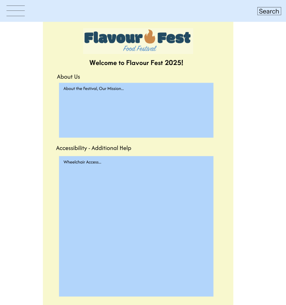
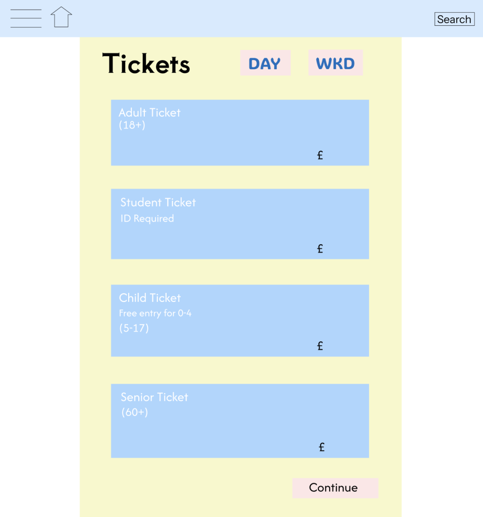
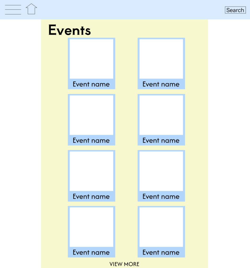
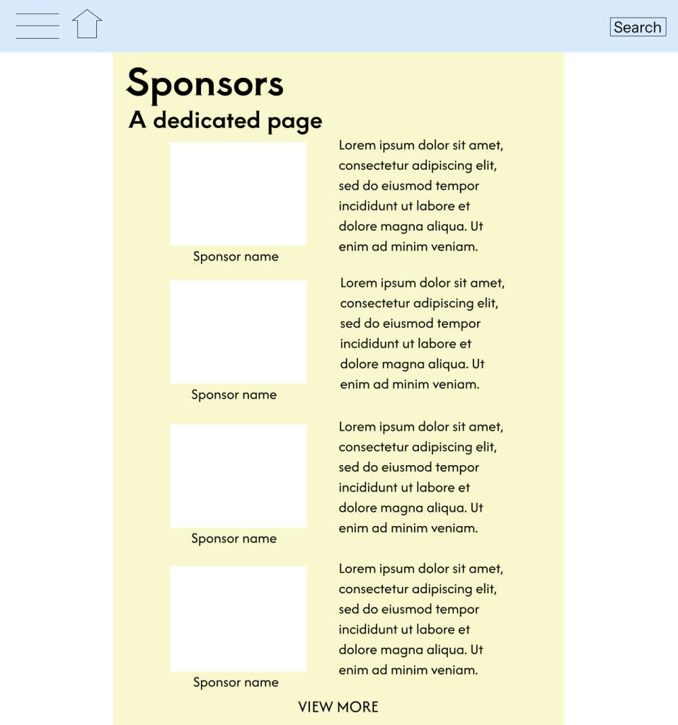
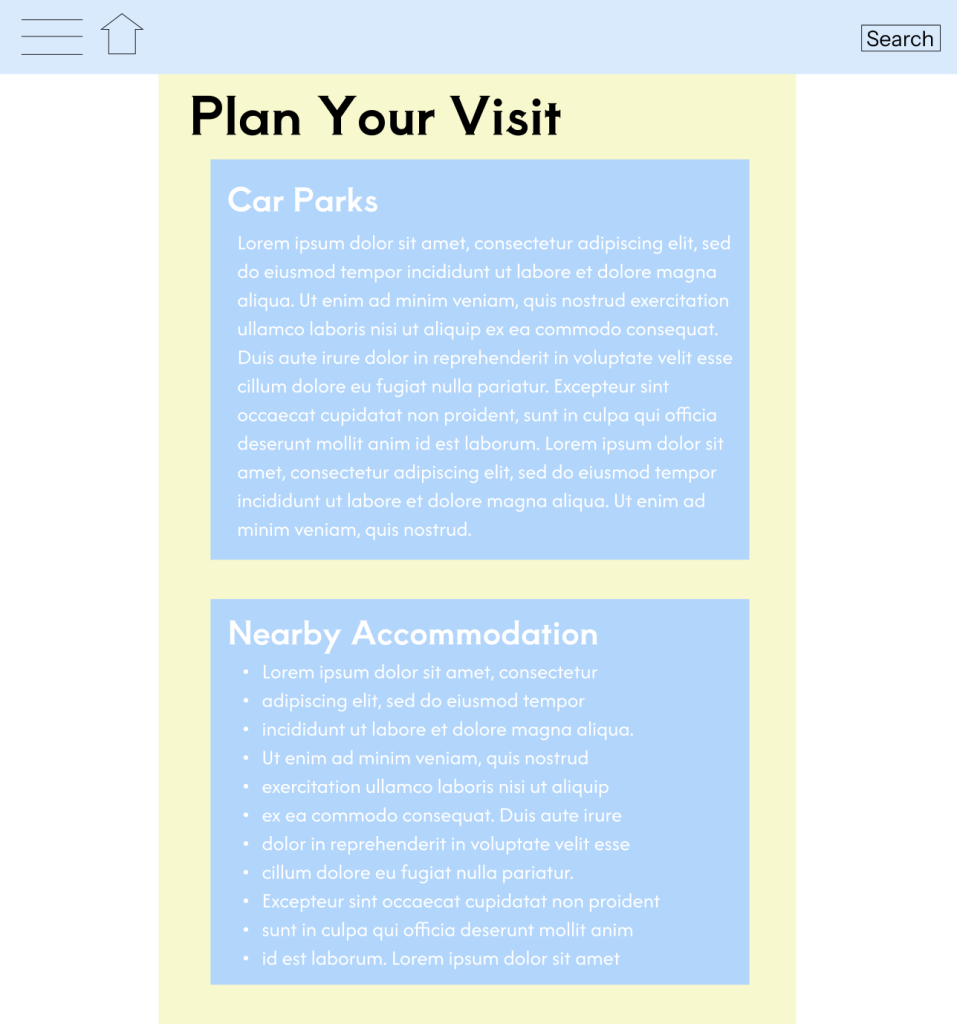
Ultimately, I believe these designs fit into the website format fairly effortlessly and look sleek and organised. There is two columns either side of the website which I have placed, to keep it similar to the app design. I think this creates a decent amount of negative space. The scale is slightly bigger so I had to ensure everything fit into this scale, but I think that’s worked well. The header/bar along the top expands across the whole composition, which I think allows it to stand out. I’ve only included the festival logo on the main Home Screen as I don’t think it needs to be repeated all the time. I believe these designs are very universal so that they’d fit lots of different frames and formats. I think this is important for a festival design. Essentially, I believe these designs create for a fun and enticing website design for a food festival.
Rejected Designs
These are my rejected designs which I decided against whilst testing out different styles and designs, as well as I did with the app designs.
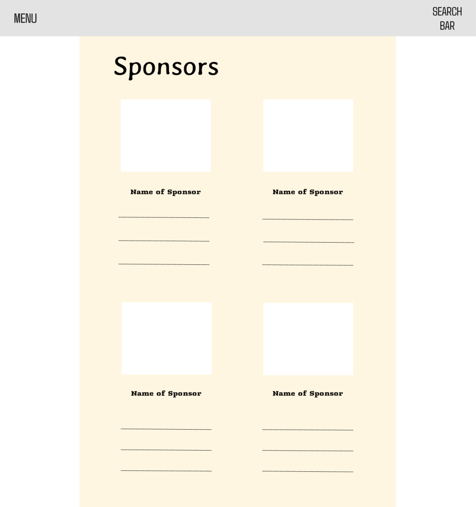
I don’t enjoy this sponsors page as although I like a clean and minimalistic look, I feel this is too bland and washed out. The colour scheme is full of dull, neutral tones. It could use some contrast or extra colours. I also believe there is too much negative space available, making the space look empty. The heading ‘Sponsors’ feels a bit too formal or disconnected. I also think the fonts used throughout don’t suit the vibe of a food festival. Lastly, I don’t like the term ‘MENU’ and ‘SEARCH BAR’ as I think it looks tacky and unprofessional. Ultimately, I believe this looks like a serious website, when a food festival is meant to be something exciting and fun.
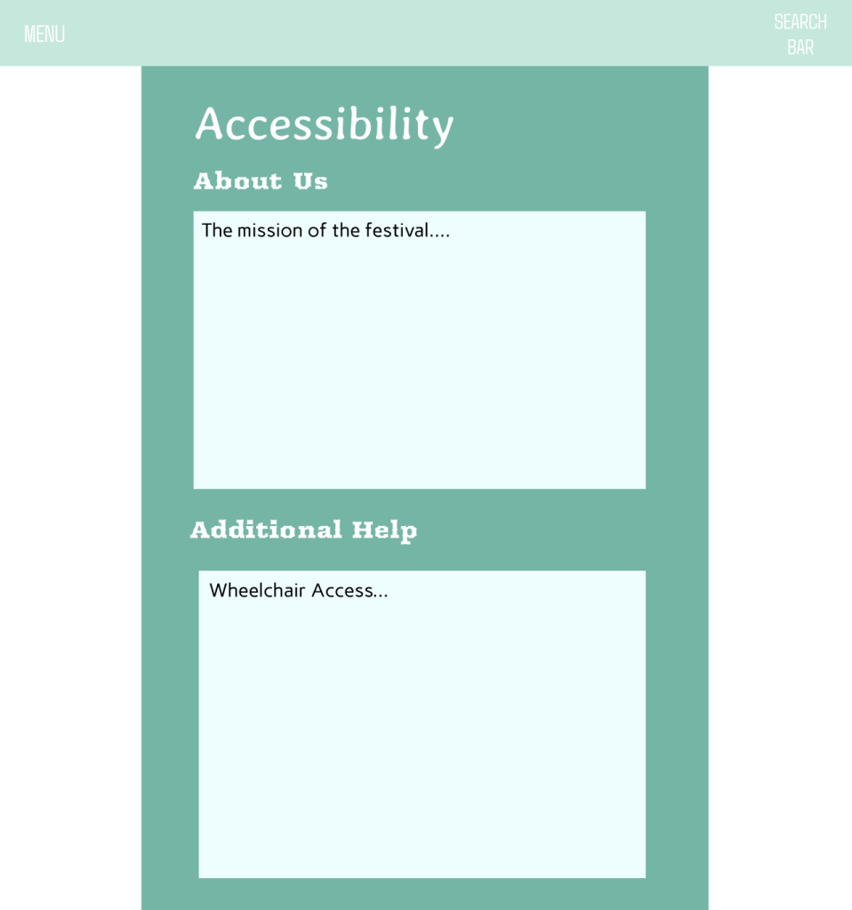
This is my final rejected design I decided against which is an Accessibility page. I don’t think the green suits the vibe of a food festival. ‘For many people, the color green means nature and brings to mind lush grass, trees, and forests.’ (very well mind, 2023). This doesn’t give connotations of food and drink. The white text on that pale green in the header makes it really hard to read the menu and search bar, there needs be to darker text or a lighter background. I also think all the fonts don’t suit each other and really clash. I’ve mixed a stylised heading font with basic sans-serif text, which can work, but here it feels slightly mismatched. The ‘Additional Help’ heading feels almost heavier than ‘Accessibility’, which can confuse users about importance. Lastly, I also think a logo should be incorporated on this page, as I think this would be the main/home page.
Reference List:
Cherry, K (2023) How Does the Color Green Impact Mood and Behavior? https://www.verywellmind.com/color-psychology-green-2795817 [Accessed 14 April 2025]