App Design Development
These are my mid-fidelity layouts I created in Figma using the principles of UX and UI. These layouts include the home page, menu bar, tickets pages, events pages, sponsors pages, and a plan your visit page. Moreover, whilst creating each page, I kept in mind my user journey map so I could ensure my app turned out as suitable to as many users as possible, as I want it to be easy and accommodating which was also what a lot of users wanted based only user personas.
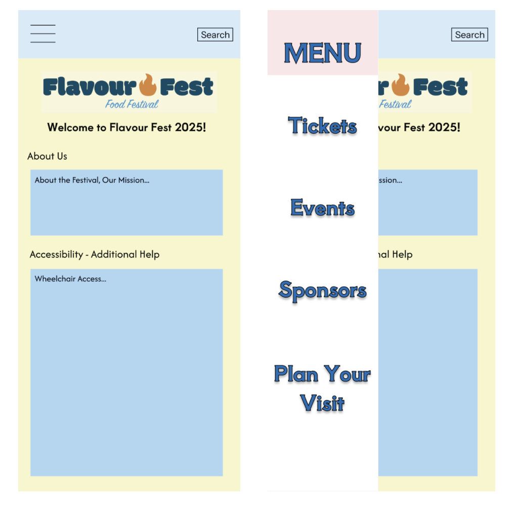
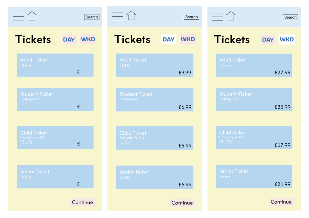
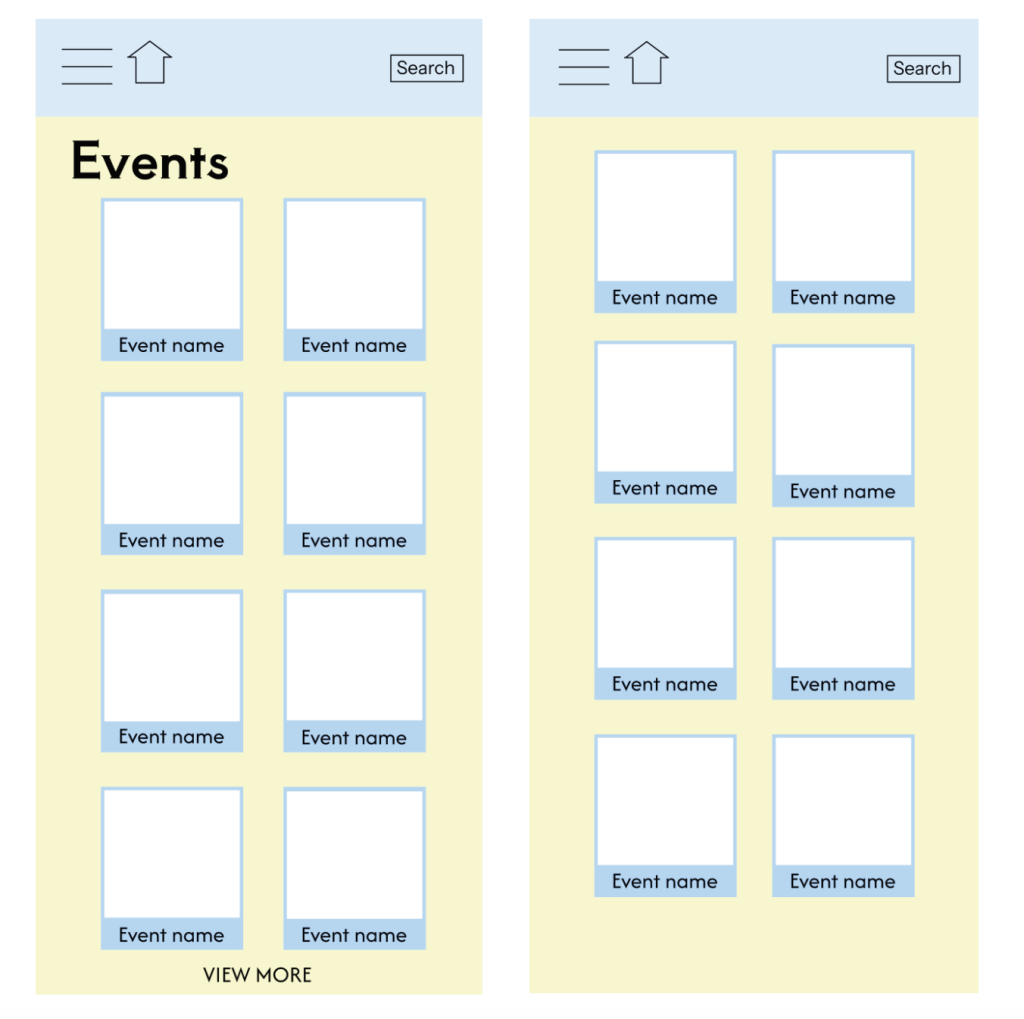
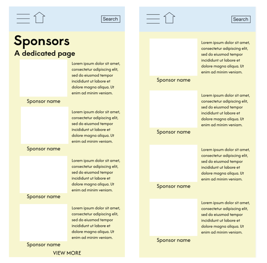
I enjoy these layouts I’ve decided on as I appreciate the consistent positive, sleek theme throughout them all. I think the main colour scheme of blue and yellow looks really effective for a food festival, almost captivating the vibes of a bright sunny day. The additional pops of colour, for example the logo on the home page, also keep the app exciting and unpredictable. I believe there is a good amount of negative space so the app isn’t overwhelming, but that it still contains a substantial amount of information. All the information allows users to get excited for what will be at the festival. The fonts are bold and clear to help those read with sight problems or dyslexia. Lastly, the users should clearly know how to function the app due to elements I have included such as the clear menu, home button, search bar, and ‘View More’ and ‘Continue’ buttons.
Rejected Designs
These are my rejected designs which I decided against before I found my style for my festival.
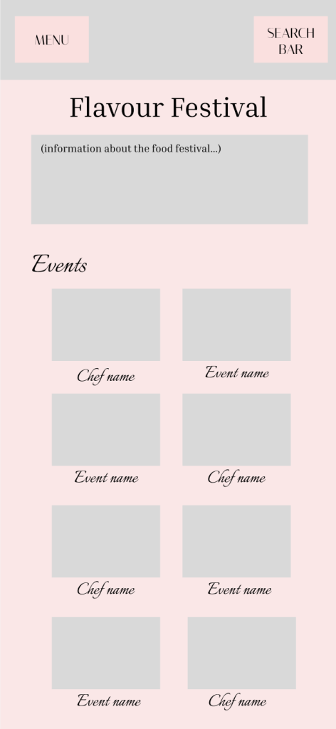
For this design, the serif font is too formal for the events and event names which doesn’t match the mood and tone of a festival. Moreover, despite loving the colour pink, I don’t think the main colour being pink for this festival is very fitting. I think the pink and grey colour scheme doesn’t scream festival. Lastly, I really don’t like this way of showing the menu and search bar, as I believe it looks really unprofessional and that it should be demonstrated in a very different way.
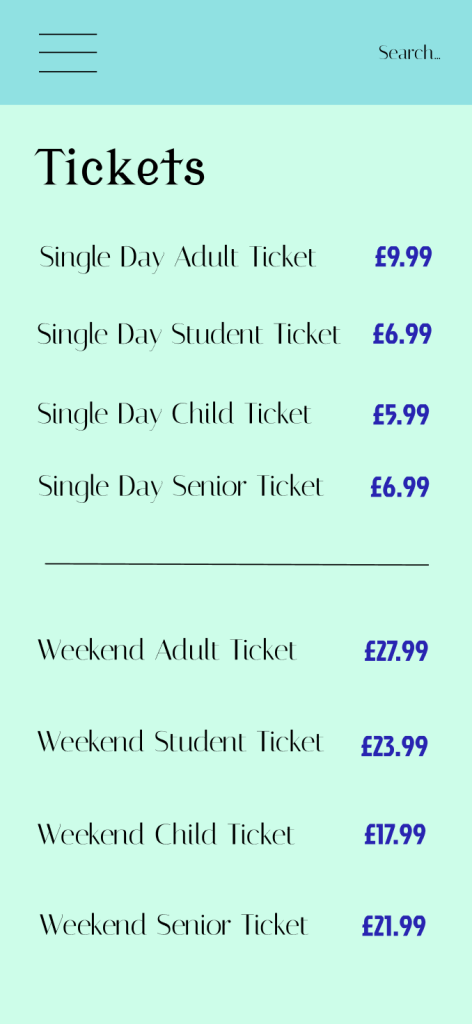
Lastly, I don’t like the layout of this design. I don’t enjoy the repetitive tickets repeating whether they’re weekend or day tickets, instead I decided there should be a section you can click on depending on what tickets you want to view. I also think a section around each ticket is necessary as it makes it feel more like a physical ticket. I also don’t like the bold font type of the price, as I think it distracts from the rest of the design. Finally, I don’t enjoy the monochromatic blue colour scheme as I think it falls very flat for a food festival full of spices and flavours etc. That makes me envision more colour. This was confirmed in some research, how ‘for your desk area, blue or green monochrome colour schemes would work best because both colours create a sense of calm and wellbeing’, but I don’t want the mood and tone to be calming for a food festival, I want it to be exhilarating and busy. (modulyss, 2025).
Reference List:
modulyss (2025) The power of monochrome. https://modulyss.com/en-GB/blog/the-power-of-monochrome#:~:text=For%20your%20desk%20area%2C%20blue,quiet%20zones%20and%20relaxation%20areas. [Accessed 14 April 2025]