Initial ideas and concept development:
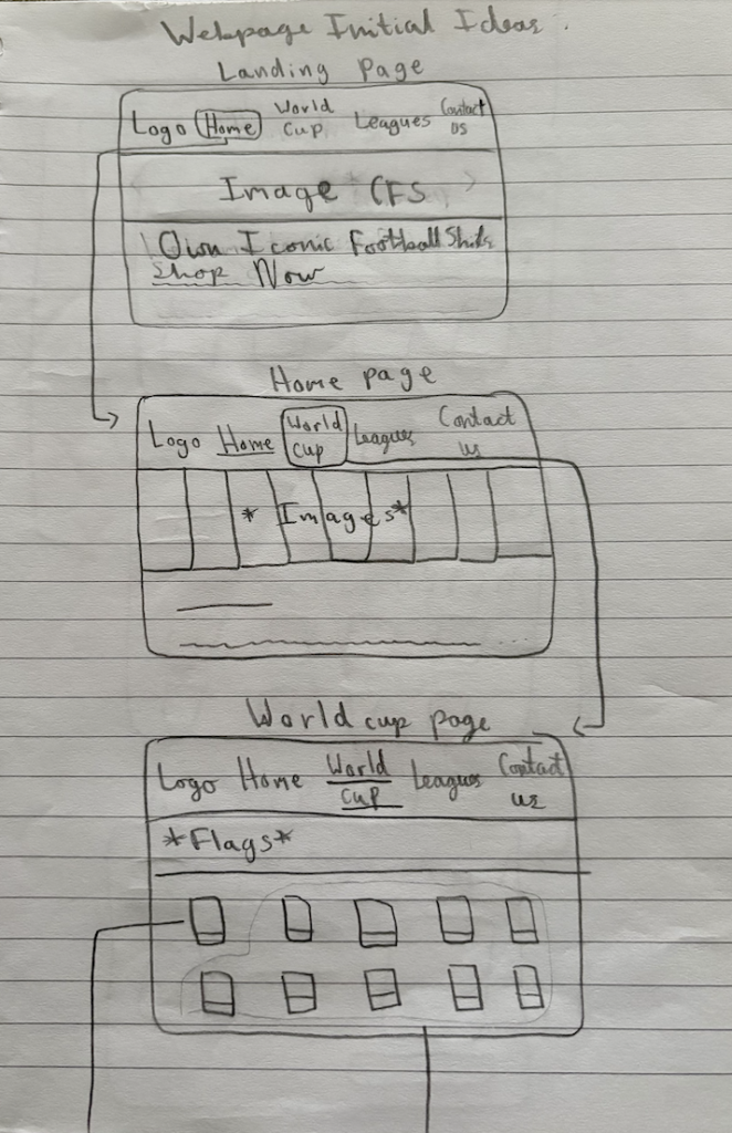
In the early stages of this project, our team focused on generating a range of exploratory ideas in response to the Classic Football Shirts brief. I approached this through quick sketching, mood boarding, example sitemaps, discussion, and more, aiming to establish a strong visual direction. A key starting point we eventually decided on as a group was nostalgia, focusing on iconic moments in football, as Classic Football Shirts operates within a space that connects football culture, memory and identity. Visually, I experimented with designing inspired by different areas of football. These decisions were influenced by art direction principles discussed in studio sessions, particularly the importance of tone and consistency across platforms, which I believe is evident across the design. My group helped by sharing expertise in football and marketing. I also considered platform-specific design early on, developing rough ideas for social media posts and web pages. I also considered poster designs to grab the viewers attention. This development helped me envision bringing the brief to life and how it would be applied. Moreover, collaboration played an extremely important role in shaping these ideas. Working with marketing students encouraged me to think more strategically, ensuring that the concepts were not only visually engaging, but also aligned with audience targeting and campaign goals. It gave me an additional perspective which I really appreciated. As a result, I believe these early ideas certainly balanced exploring creatively with practical application, forming a strong foundation for further development and designing.
The Big Idea – Teamworking:
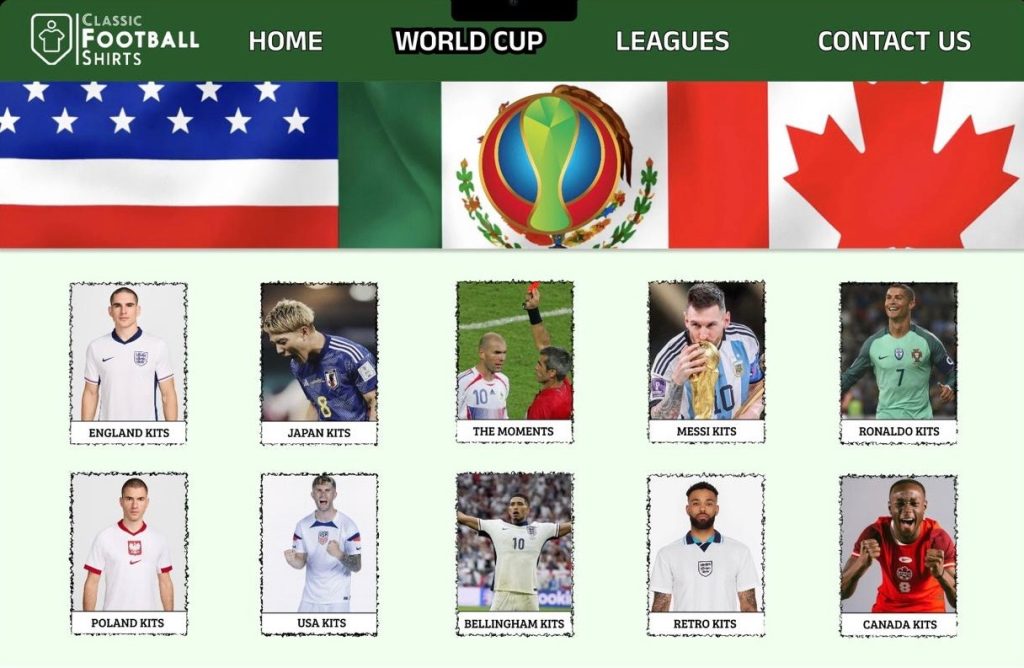
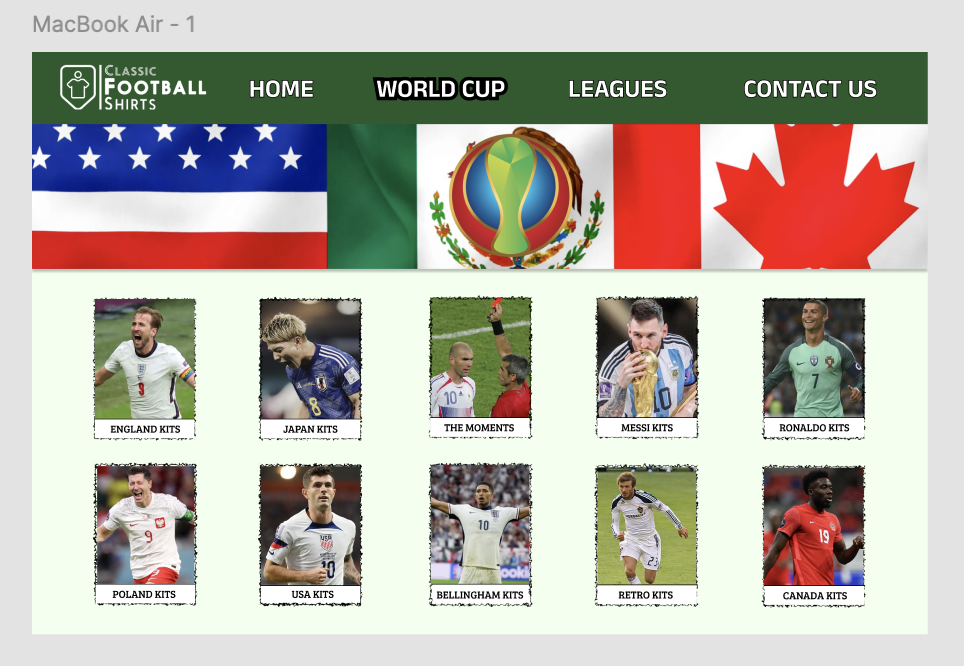
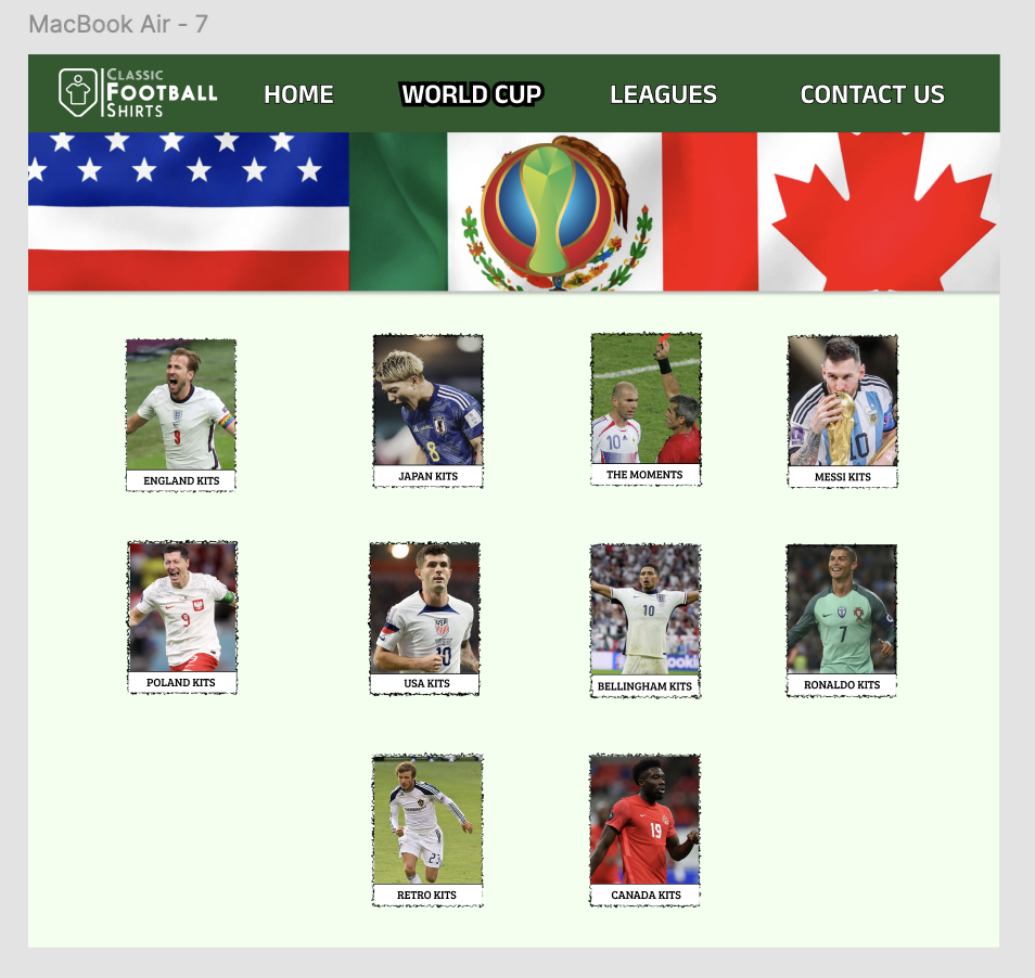
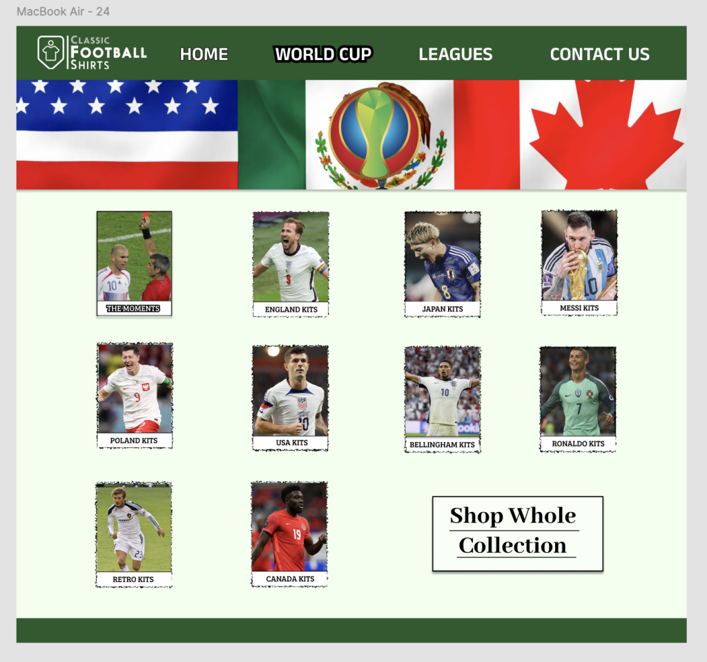
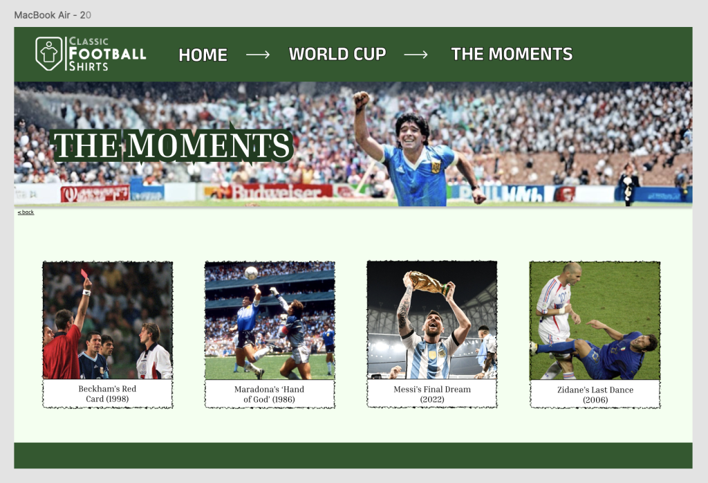
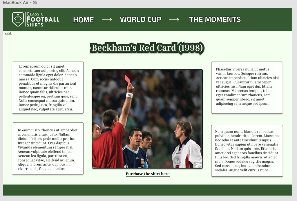
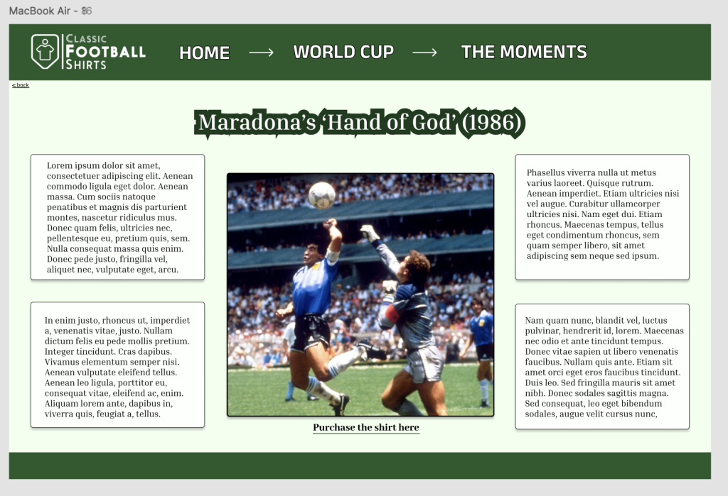
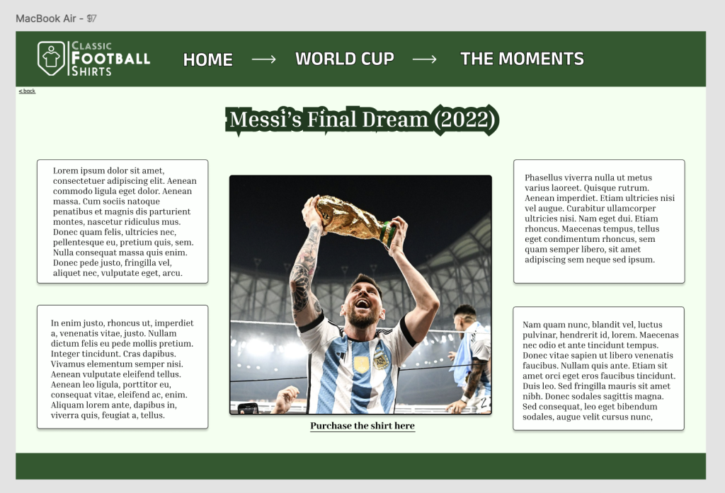
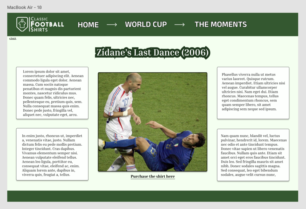
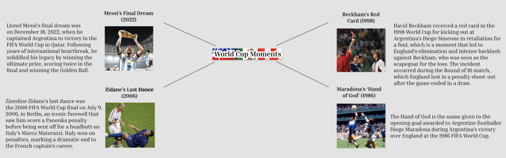
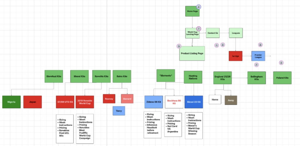
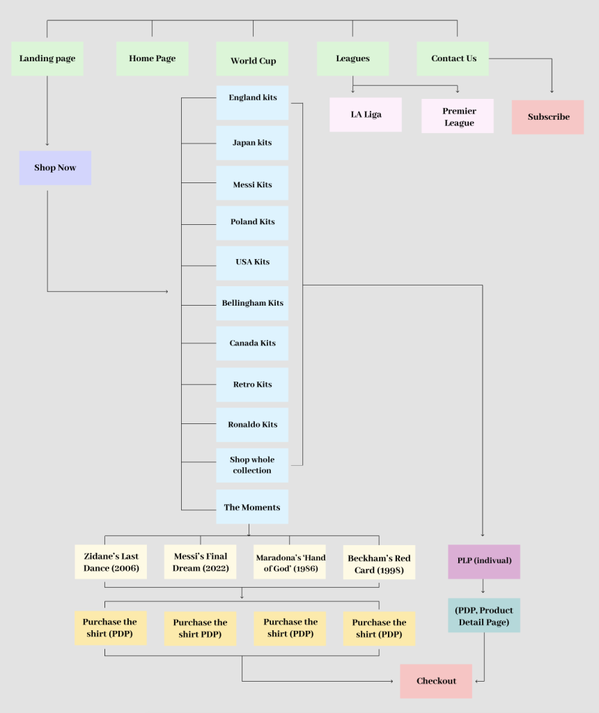
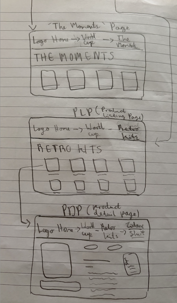
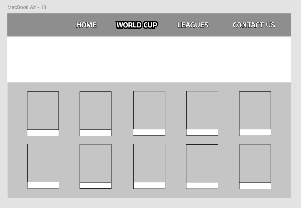
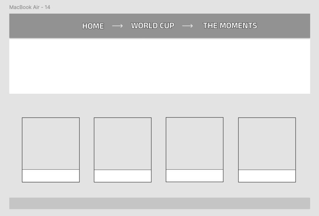
Through collaborative workshops, our team developed our central ‘Big Idea’ focusing on ‘The Moments’, reconnecting fans with the significance of football shirts. The concept centres around the iconic history, positioning Classic Football Shirts not just as a retailer, but as a centre of football history. Rather than simply showcasing the shirts, the campaign highlights the stories and impact behind specific shirts, connecting it to a memorable moment in football. This approach encourages audiences to engage through recognition, creating a strong connection to the brand, and perhaps reminding them of their passion for football. The idea was applied through a series of visual explorations through scale, placement, etc, rather than an overwhelming structure. Across mock-ups, we tested how the shirts could be showcased. I received feedback from my peers that the ‘World Cup’ webpage would benefit from the pitch within the background of each player to provide visual consistency and to show its history, which I then included. I was also informed by Ash that it was perhaps overly cluttered and needed more spacing, therefore I gave it a scroll element. Lastly, I added some structure within the bottom of the composition, refined the positioning, and incorporated a CTA. The clear CTA ‘Shop Whole Collection’ ensured the concept remained functional, linking the history aspect back to the brand’s core purpose, allowing them to browse all the shirts. Furthermore, the art direction focused on balancing nostalgia with a clean style, using bold typography, imagery and colour palettes inspired by the football pitch. Lastly, a key focus of the campaign was discovery rather than persuasion. Instead of directly explaining each moment, visuals were designed to prompt recognition and curiosity.
Review the Big Idea stage of this project brief – design responses:
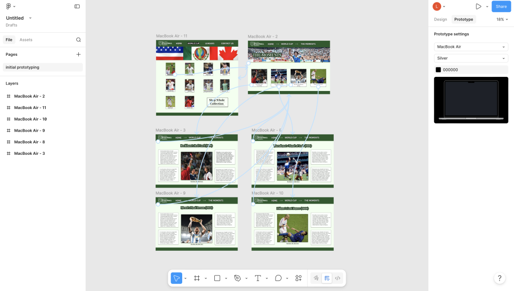
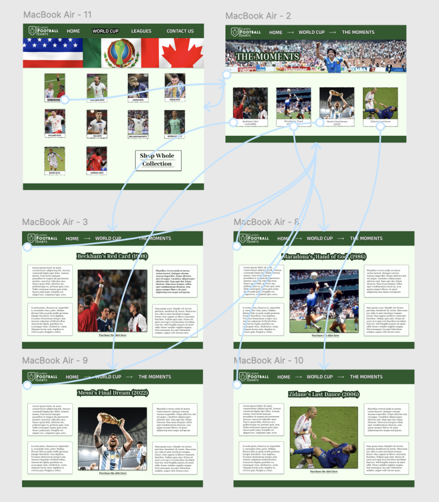
(only certain elements prototyped due to not needing to do full website)
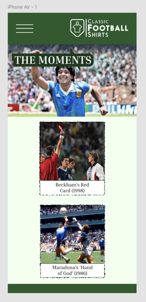
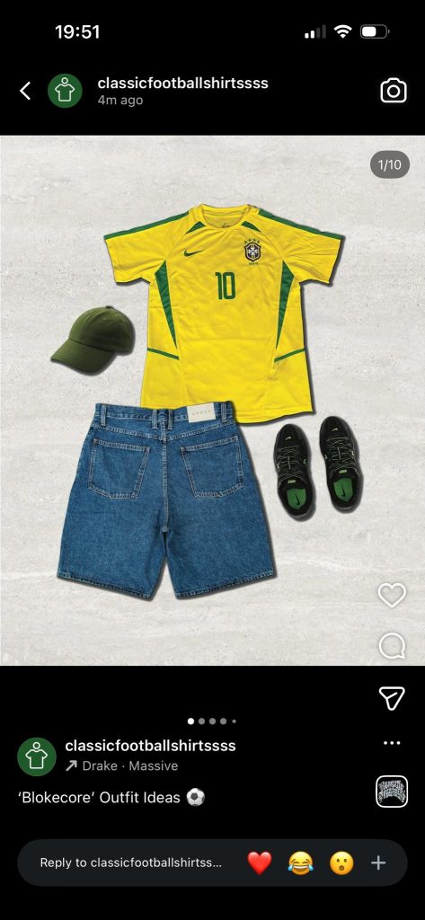
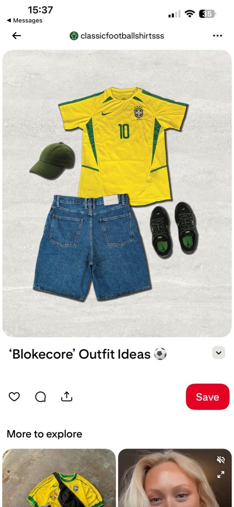
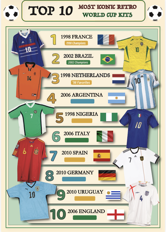
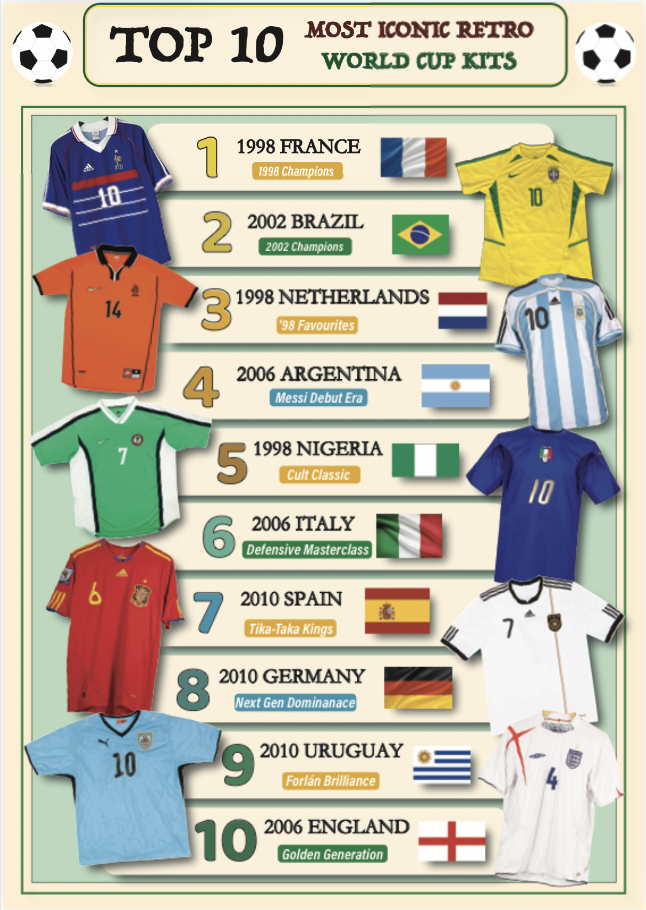
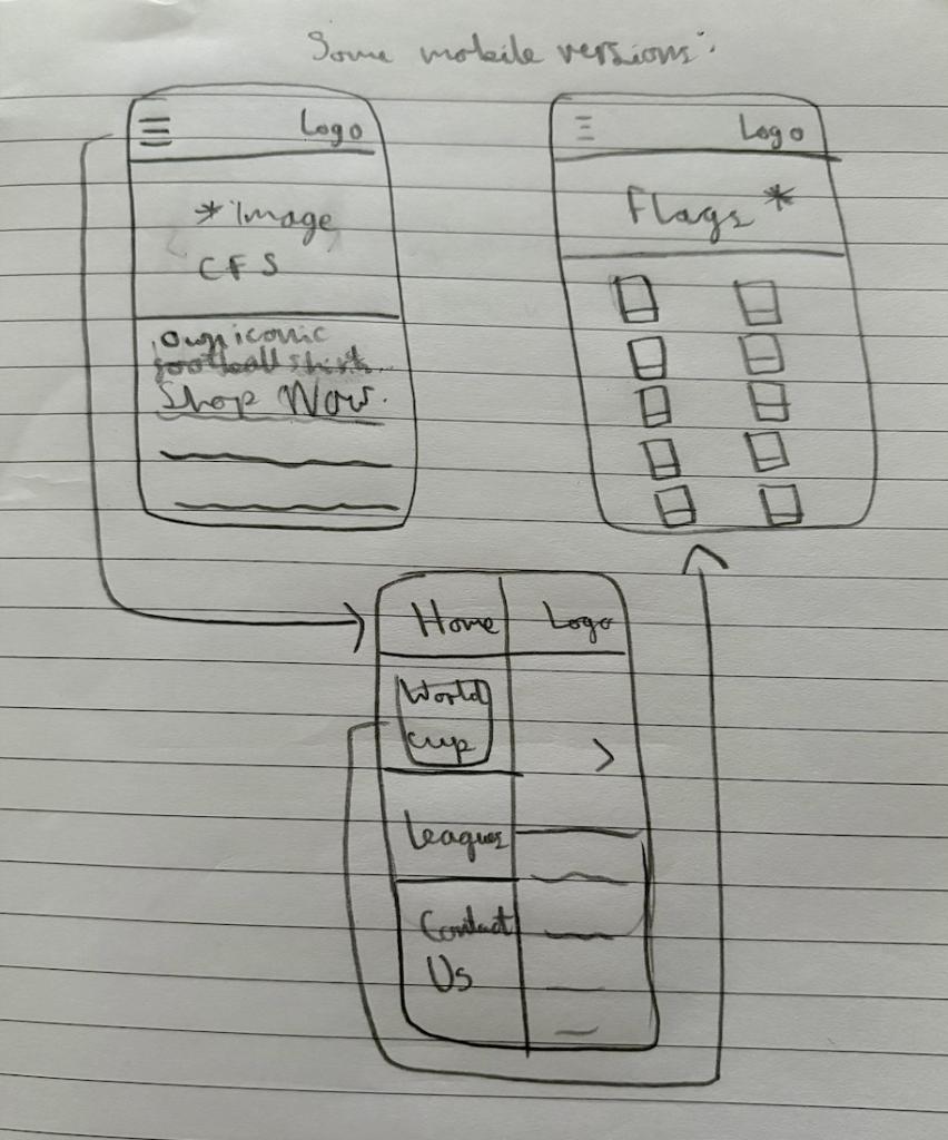
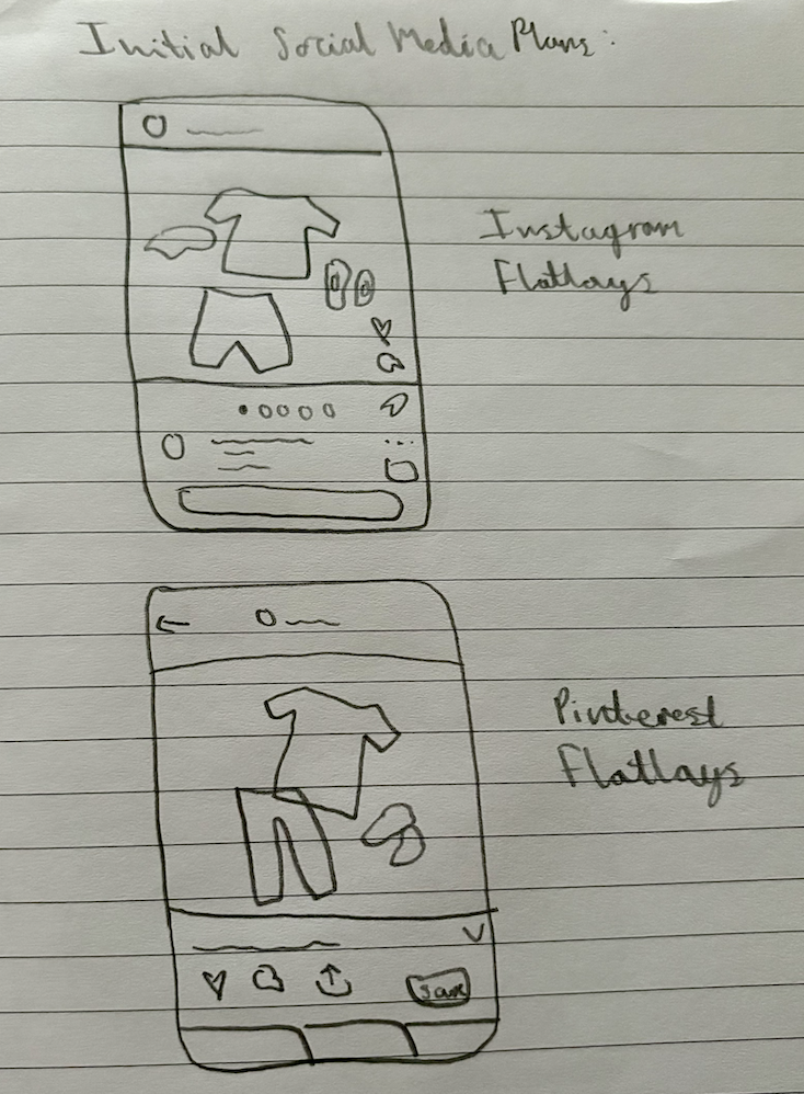
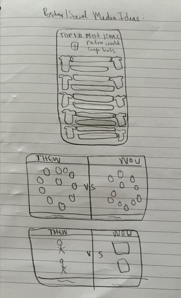
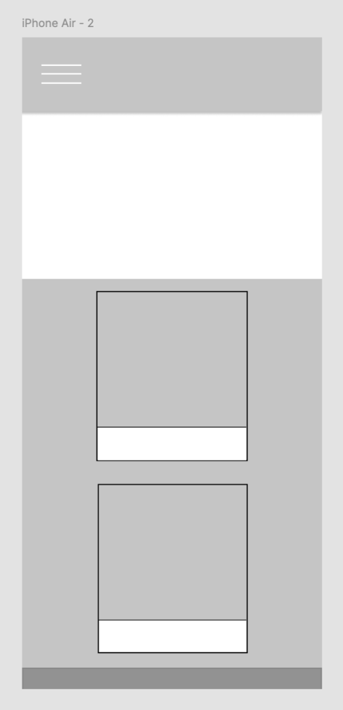
Lastly, following feedback, our team moved into a more refined stage of design development, focusing on iteration and beginning prototyping. We discussed ideas of what would grab users attention, and I developed draft layouts across multiple platforms, including a mobile web design and initial social media visuals, ensuring consistency in typography, colour and imagery. Prototyping allowed me to test how users might interact within the campaign, particularly the storytelling aspect. Additionally, I tested layout structures that allowed the product and context to remain prominent. I also refined design frameworks such as typographic hierarchy and image cropping styles. Iterations were informed by both peer critique and discussions within the group. This process highlighted the importance of flexibility within collaborative design. We believe the refinements strengthened the overall design and usability. For example, I was unsure what text to place in the tags of the Top 10 Pinterest/poster design, therefore I asked my peers for ideas as I knew they would know more interesting terms. The social media flat lays also provide inspiration on how to style the shirts, focusing more on the fashion side of the shirts, in which Ash told me would do very well on Pinterest, giving me inspiration to create a mock up for on Pinterest too. Moreover, I believe the final proposals selected for progression into the next stage demonstrate a clear link between concept, art direction and audience engagement, highlighting creative exploration and strategic thinking, forming a strong foundation for the final design outcomes in the portfolio stage.
Board which has some of the work on from this post:
(Images sourced via Google Images for exact historic moments)