Link to my Figma Design File:
Overview of the High-Fidelity Design:
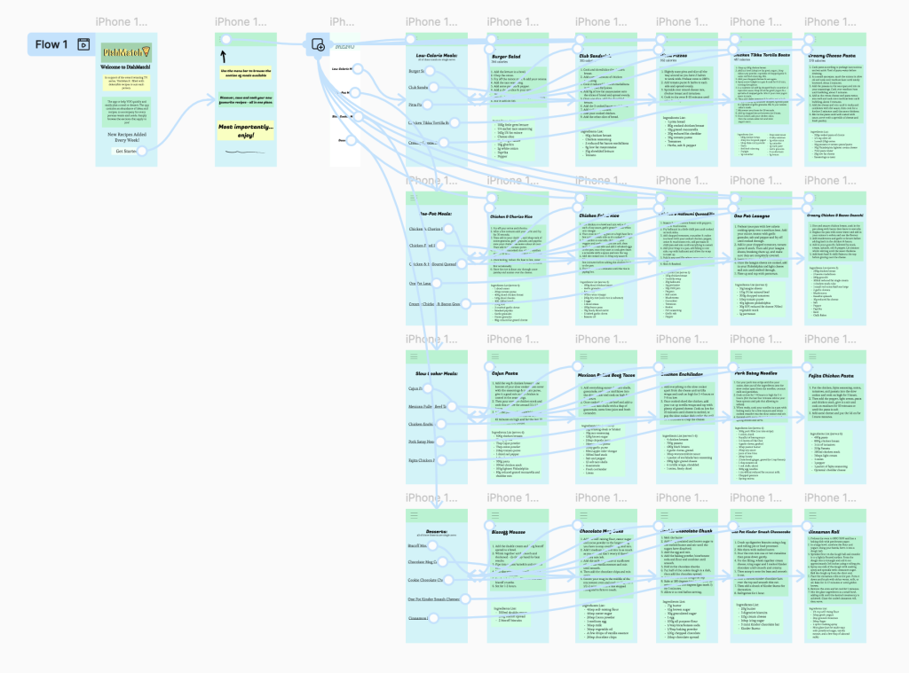
Overview of the Wireframe:
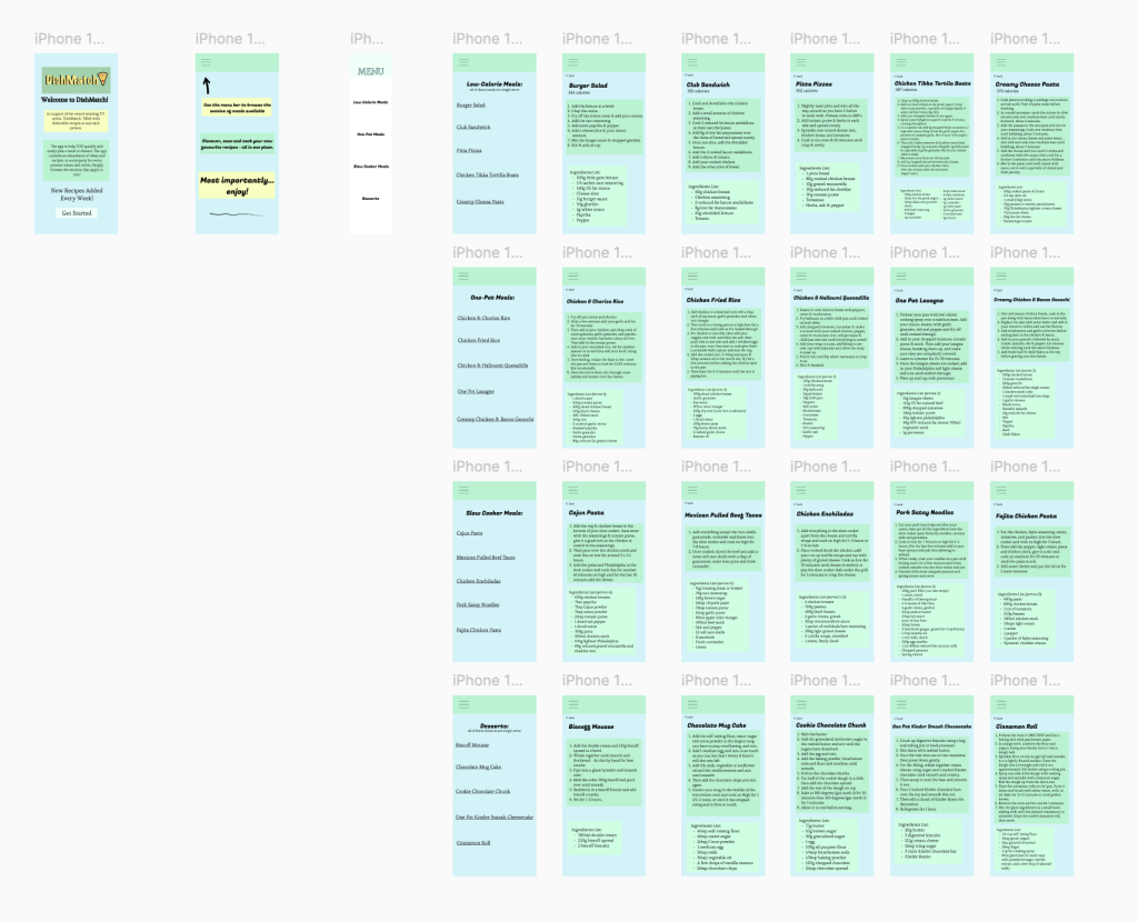
This is my high-fidelity prototype mobile application interface. This contains all the glorious recipes, famously known that they are going to be delicious, due to the award winning T.V. series, DishMatch. To delve into my choices thoroughly, the main thing that grabs our attention is the colour consistency. I decided on the use of a light blue/green background throughout the app provides a consistent visual theme. ‘Shades within blue and green give balance and harmony to a scheme.’ (fabricsandpapers, 2024). I believe the light pastel colours feel friendly and inviting, which suits a recipe app. The font size and style are clear and consistent throughout. The different headings are clearly distinguishable from the main body of text due to larger and bolder fonts, which helps readability. This is the successful use of typography. Moreover, the categorisation of recipes are clearly divided into different categories. This makes the navigation intuitive. Additionally, the navigation menu of the menu icon helps for easy access on the mobile. Furthermore, each recipe for the user has a clean layout with the methods and ingredients lists clearly bullet pointed, making it easy to follow. The visual hierarchy is also very evident, as titles, instructions, and ingredients are separated effectively. Ultimately, I believe the design is a clean and consistent interface with visual engagement. On the other hand, to delve into more specific elements mainly on the first main page, the logo is a really important element to the design. The colour scheme ties in with the rest, containing a bold three dimensional type face and a visual food element. I also included an element of onboarding which is the process of guiding new users so they quickly understand a product, service, or experience. I’ve included an element of this stating ‘Welcome to DishMatch!’ to immediately introduce the viewer. The menu is also an example of onboarding as it’s a guided walkthrough which shows users the categories of recipes. Ultimately, this is how I used Figma for optimum functionality.
Reference List:
Interiors, F. (2024) Fabrics and Papers. https://www.fabricsandpapers.com/blog/blue-and-green-room-ideas?srsltid=AfmBOoofR2vBwsmswaiHhhCWTkBbNAP-tyQQkWu5R6Iy9w7u-DdZMmAU [Accessed 17 May 2025].