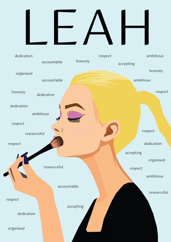
This is my first self-promotional image poster. I decided to illustrate a side profile image of me putting makeup on to come back to the idea of me being really into all things makeup and beauty. I took inspiration from further vector portraits and used the pen tool to create a minimal but abstract illustration (Figure 1). I chose to exaggerate my makeup by adding purple eyeshadow and lipstick, to show how creative and limitless makeup is. To effectively promote myself in this poster, I decided to add multiple different qualities and traits about myself that I’m proud of around the background of the poster, to showcase who I am to a potential graphic design employer. I used a sans-serif font for this as there is quite a lot of text so I wanted a fairtly basic font. Finally, I decided to include my name as a title fairly large in a sans-serif font which adds a sleek, simplistic look. This creates an aesthetically pleasing composition with a good amount of negative space. I also think the colours used aren’t overly bold, allowing other aspects of the design to really shine through.
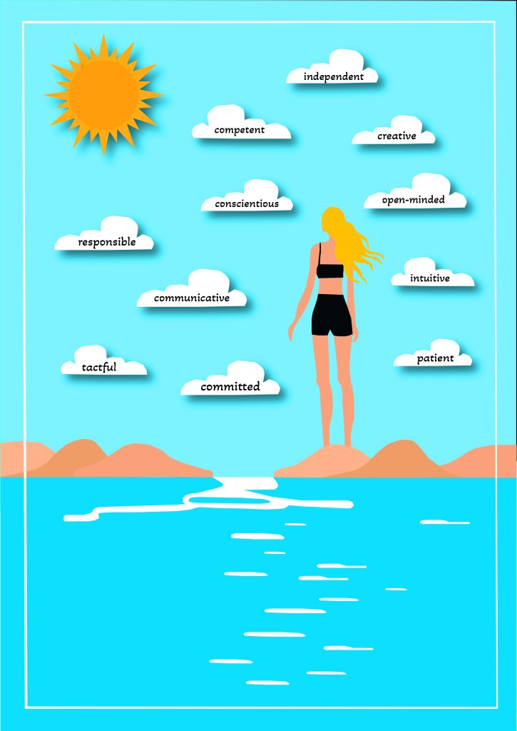
For this second self-promotional image poster, I decided I didn’t want to include my face this time. I wanted to go back to the idea of nature, so I decided to illustrate myself stood in one of my favourite places, the beach. Hornsea beach is one of my favourite as it has a tiered promenade along the landward side (Figure 2). I created the sea, rocks, sky, clouds, and a sun obviously with pen tool. I ensured I illustrated myself stood facing the clouds, as I knew I wanted to place some texts in the clouds. I decided to add more traits about myself within these clouds, as this gives the typography a sense of structure. I also added a drop shadow on these clouds to allow them to stand out further by creating a dimensional effect. I also added this on the sun. I feel the way I’m facing the clouds looks as though I’m reflecting upon these characteristics written within them which is an interesting idea. In addition, I decided to make the colours in this poster design quite highly saturated as I haven’t completely experimented with that yet, so I adjusted the hue/saturation. Furthermore, I also added a border around the image, to create the feeling of a poster and add some structure. Ultimately, I believe this design creates a positive and uplifting mood and voice which reflects myself.
Reference List:
Figure 1: bay, P (2017) Pixabay Free Woman Vector Portrait Images https://pixabay.com/vectors/search/woman%20portrait/ [Accessed 5 December 2024].
Figure 2: Riding, E (2024) Find a place https://www.eastridingcoastandcountryside.co.uk/places-to-visit/find-a-place?entry=hornsea_beach#:~:text=Hornsea%20beach%20has%20a%20tiered,kite%20flying%20or%20just%20relaxing. [Accessed 8 December 2024].