Logo:
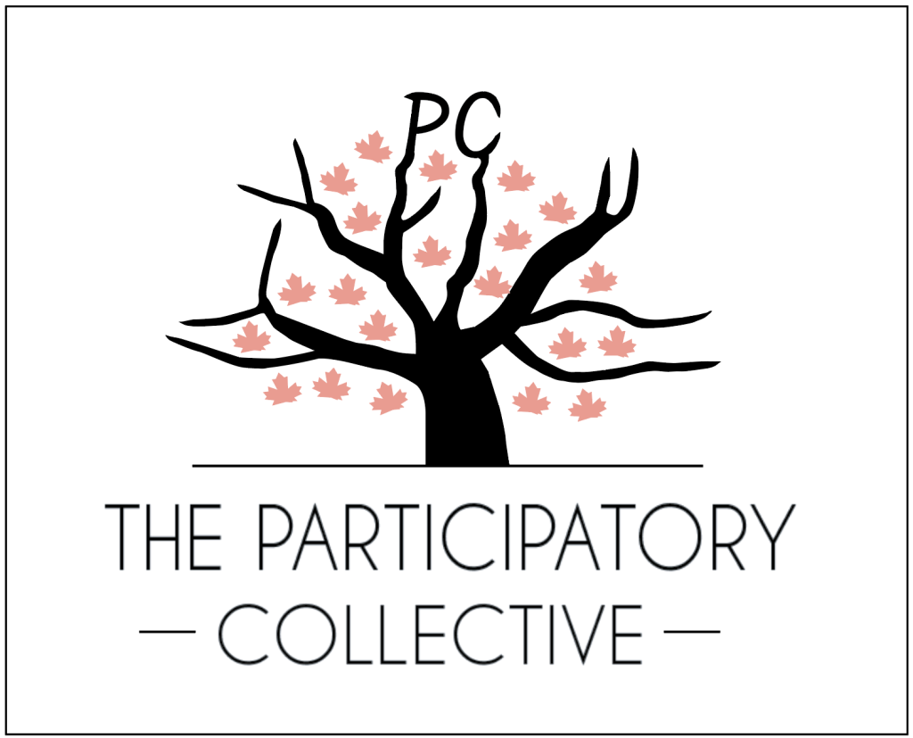
This is my finalised logo design which I haven’t changed as I think it’s really fitting for my design. This is used frequently to establish The Participatory Collective. The logo uses the image of a tree to symbolise growth, connection, and shared roots. The branches represent the many community groups, individuals, and organisations involved in the Collective, all extending in different directions while remaining connected to a single trunk. This reflects the participatory principles of working together, whilst valuing different voices and experiences. The scattered leaves suggest ideas, stories, and knowledge being shared. Overall, the logo visually reinforces the Collective’s focus on collaboration, inclusivity, and building long-term change through collective action.
Colour Palette:
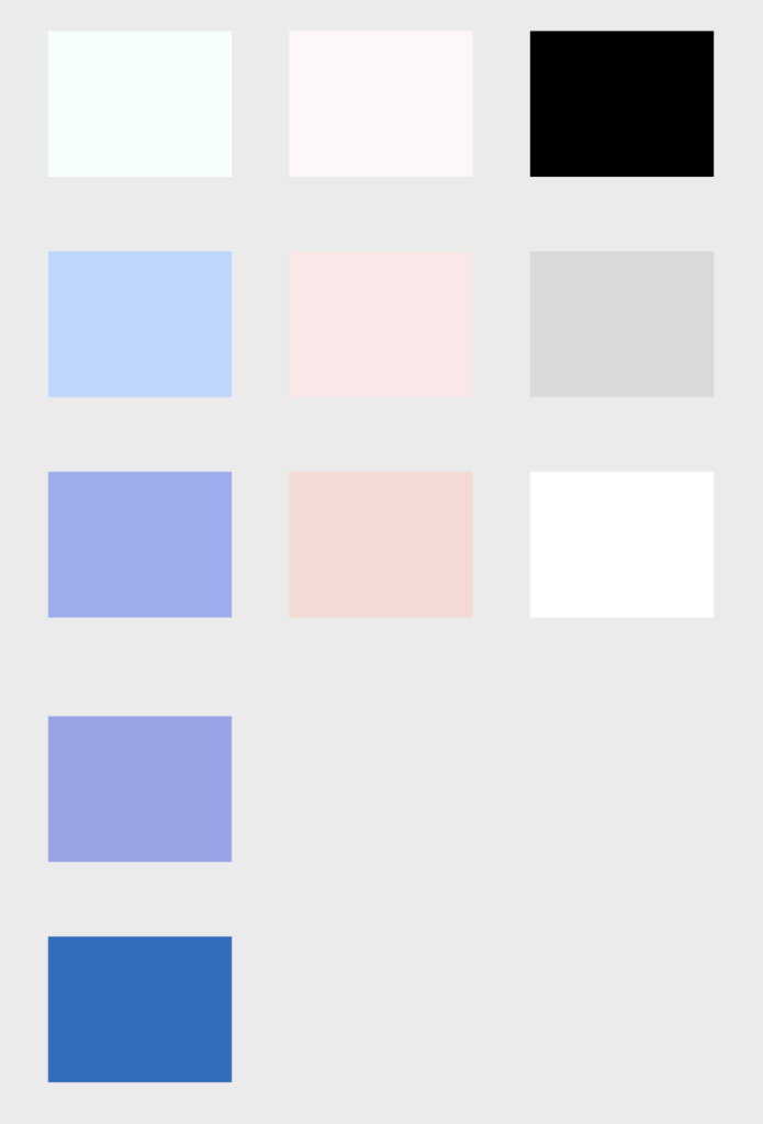
I believe this colour scheme is soft, modern, and well balanced, combining calming blues with warm blush tones to tie in with The Participatory Collective. The light neutrals keep it clean and airy, while the darker accents provide contrast for structure.
Additional Colour Palette from logo and growing tree element:
This colour scheme is more rich and grounded, balancing warm reds and soft pinks with deep greens and blues. The lighter tones add warmth and softness, while the darker shades bring depth and sophistication. Overall, it has a mature, elegant feel with strong contrast and visual weight.
Main Typography System:
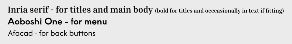
The typography system has a mixture of serif and sans-serif fonts. I believe this creates clear hierarchy and improves readability. The serif adds warmth and character, while the sans serif keeps the content clear and accessible across digital platforms.
Image Direction:
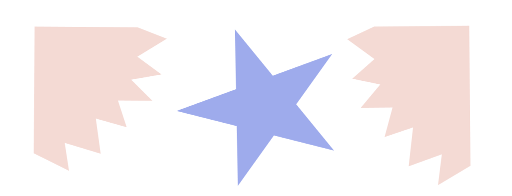
These are some shapes and designs I created to incorporate throughout my designs and create a consistent theme that is complimentary. These have been used in lots of different ways with varying opacities.
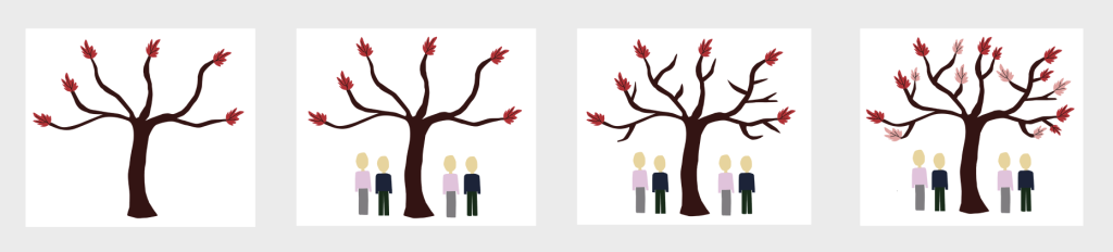
I created this growing tree element to place gradually across the pages to symbolise The Participatory Collective growing, as I felt this would help integrate a storytelling element into my design as this links the sections together. I believe this helps to reinforce the message and give my work a stronger sense of cohesion.