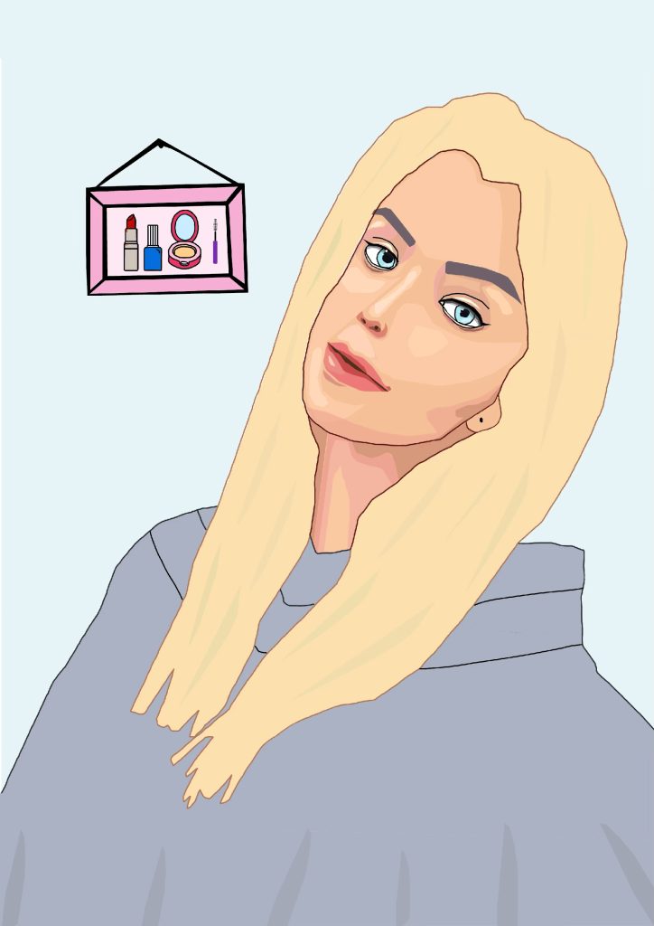
For my first Adobe Illustrator self portrait, I decided to create a fairly literate design. I started working off a secondary image picture of myself. I started off with the pen tool, just initially outlining the image, but then I decided to create some heavy details on the contrast and highlights, taking inspiration from vector portraits (Figure 1). This took a lot of time and attention to detail, noticing where the light hit my face and where the shadows were, but I think it’s worth it for the final result. I also wanted to pay attention to the different parts of my makeup too. Moreover, I ensured to choose an image where I was angled to the side to create an informal feeling. This also allowed me to add something in the background that reflects who I am. I am very into makeup and beauty and how it allows everyone to express themselves differently and individually. I feel like it’s a huge part of me and who I am, always exploring new products and techniques, so I decided to include a hung up frame in the background, illustrating some of my favourite products, including nail varnish and lipstick. I think this portrait really captures a lot about me.
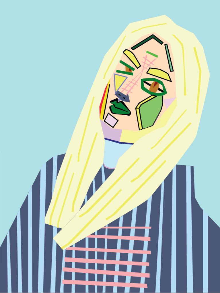
For my second Adobe Illustrator self portrait, I decided to create a more abstract outcome. This reflects boldness, fun and excitement, which I believe are aspects of my personality as I’m a very bright and bubbly person. Moreover, I took inspiration from Pablo Picasso and his paintings which I really liked and his use of geometric shapes and how it captures emotional depths, so I thought I could explore this digitally using the pen tool (Figure 2). I decided to work off the same secondary image, but it’s obviously created a very different result. I believe this image fits the composition nicely. Moreover, I’ve included lots of bright, bold colours and sharp, angular shapes to create a completely unrealistic design which expresses a lot. My abstract features communicate deeper meanings, to provoke thought, and stir emotions, and the use of colour has the ability to communicate a message without using words. These elements create a huge amount of detail which have a deeper meaning of my bright and fun side. Ultimately, I believe this design reflects a big part of my personaliy which is clearly conveyed.
Reference List:
Figure 1: Art, D (2010) Vector Portrait – Emma Watson by AryaInk on DeviantArt. https://www.deviantart.com/aryaink/art/Vector-Portrait-Emma-Watson-172173151 [Accessed 1 December 2024].
Figure 2: Singulart (2023) 12 Famous Paintings by Pablo Picasso. https://www.singulart.com/en/blog/2023/12/18/pablo-picasso-famous-paintings/?srsltid=AfmBOoq0uW7VU-UX7znzrKfd2FBY6LdsXxocEY6H41T6C02y46dTy9PD [Accessed 3 December 2024].