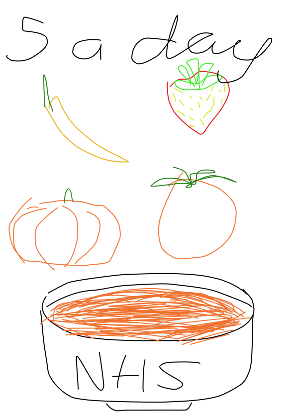


(Figure 1)
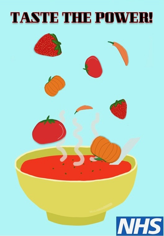
This project responded to a brief promoting the ‘5-A-Day’ NHS message to young adults ages 18-25, with the intention of reframing healthy eating as energising and culturally relevant, rather than instructional. This is because we believe this age range are often figuring things out and deem fruit & vegetables not as a priority, perhaps because of their higher price. My approach focused on developing a clear visual strategy through progressive methods including sketching, visual mapping, and digital prototyping. These processes were central to ensuring a flow between concept, audience and execution. I worked with a partner to achieve this, which was a fairly new experience for me. We was instructed to make this in a quick working style, which is what we did. The development began with quick, initial sketches to explore compositional structure and ideas. I tested multiple visual approaches, including typographic solutions and different representations of a fruit. However, through drawing and reviewing these variations, I recognised that a more dynamic composition, ingredients floating above a bowl, conveyed movement and transformation. This meant the early design idea has been presented. The early sketches worked as a critical thinking tool and allowed us to envision our idea before committing to a refined final design. I shifted the tone from public health instruction to empowerment, whilst ensuring the keep the NHS logo within the design. This process of concept development generated the headline ‘Taste the Power!’, which reframes fruit and vegetables as active sources of strength. This decision was strategic, as young adults are more likely to engage with messaging that feels motivational rather than descriptive. Moreover, I referenced contemporary flat illustration and bold colour palettes commonly used across digital platforms. This ensured the poster felt aligned with the media environment of the target audience. The simplified style enhances clear design and accessibility, while the contrast between the soft blue background and bright red soup creates a strong visual hierarchy. Prototyping allowed me to refine typographic weight, scale and compositional balance. Selecting a bold serif headline introduced authority. I ensured the design composition remained cohesive across different platforms. I considered different platforms throughout the process. The floating ingredients translate into motion graphics for social media, strengthening continuity. This reflects how contemporary art direction extends and creates consistent visual systems. Overall, these methods demonstrate how idea development forms confident ideas. Art direction operates not only through styling, but through concept, tone and audience, emphasising visual ideas and impact on the community.
Moreover, I must add, during the ‘5-A-Day’ project, we also collaborated with marketing students, which was a valuable experience. Initially, I hadn’t established a group with them, but as we started our next project, we formed a team together. Being the only graphic designer in the group could have felt isolating, but the marketing students were inclusive, supportive, and open to my contribution. This collaboration gave me insight into how both subjects cross over, highlighting the importance of communication and teamwork. I believe it reinforced that combining creative and strategic sides strengthens a project’s concept and impact.
Reference List:
Figure 1: NHS. (2023) NHS. https://www.nhs.uk [Accessed 12 Feb 2026].