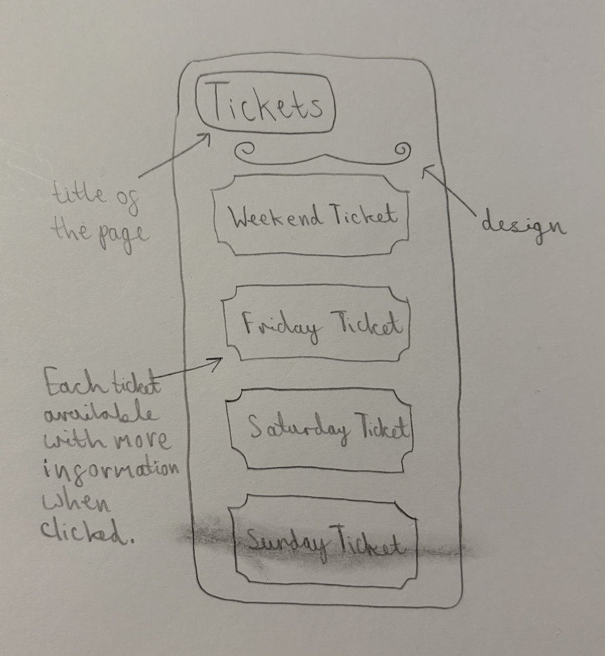
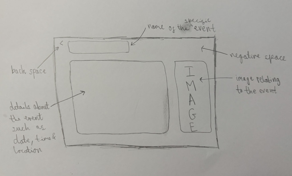
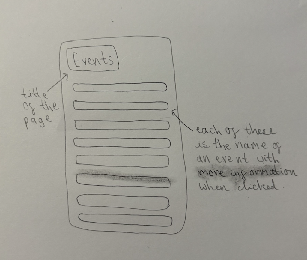
These are my rejected designs which I decided could be improved. This was either due to lack of enticing design or usability etc, any marks, for example the mark through ‘Sunday Ticket’ on the first design is just a rubber mark as my rubber wasn’t strong enough, so these marks are to be ignored.

This is my first rejected design. This is a page with the ticket options available to purchase. I think the title is in a good proportion with the rest of the composition as it’s a substantial size, and I also like the little design underneath almost underlining it and adding some detail. However, what I don’t like about this design is the tickets. I tried to shape each clickable ticket in the shape of what physical tickets used to look like, as I thought this would look effective, however I actually think it looks slightly old fashioned and I think rectangles will give a sleeker appearance in the final design.

This is my second rejected design. This is a page based around one of the events. Firstly, I think the section of the title lacks emphasis and doesn’t have enough of an impact on the page as it’s too small. Secondly, I have an issue with the amount of space for the details of the event. I think filling this gap with that much information of the event could be overwhelming for the user and stops people from wanting to attend. Users enjoy information that is given to them quickly and easily, and I think some key points about the festival is all that is necessary. I also don’t enjoy the proportion of the image and I feel as though it’s crammed in at the side.

This is my final rejected design. This is a page listing all the events available. I certainly enjoy simplicity, however I think this design is far too simplistic. I don’t enjoy each event simply being listed one after another. I think it could be harder to click on the correct event you’re intending to click on as well. I think a visual element of each event would be much more enticing. That would also give users an idea of the event they’re clicking on before even reading a word. In addition, I believe this is an important page to get right because it’s what ensures users click onto the events available, viewing what the festival holds.