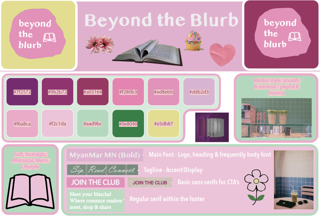
Brand Guidelines:
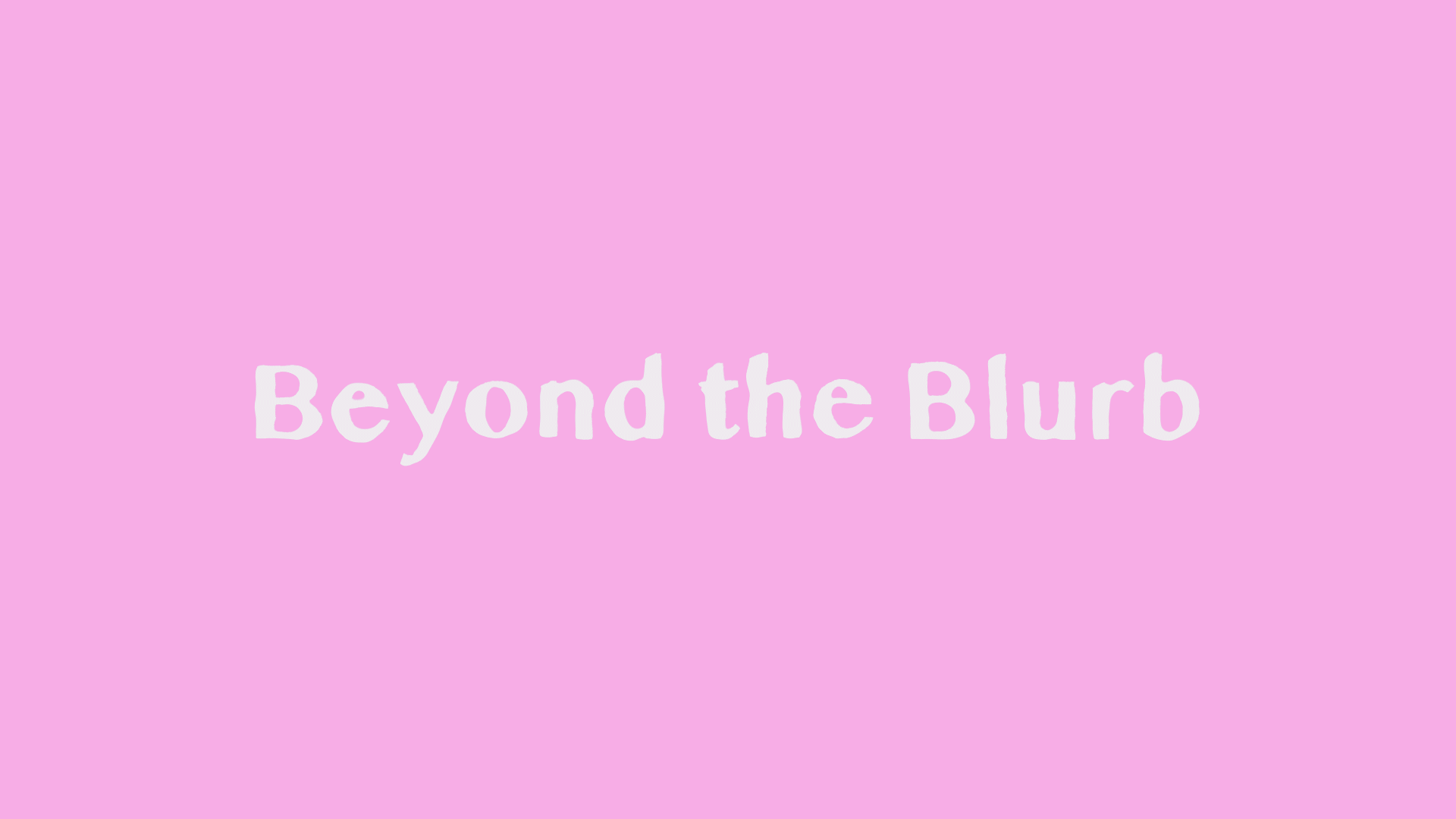
Animated Typographic Example:
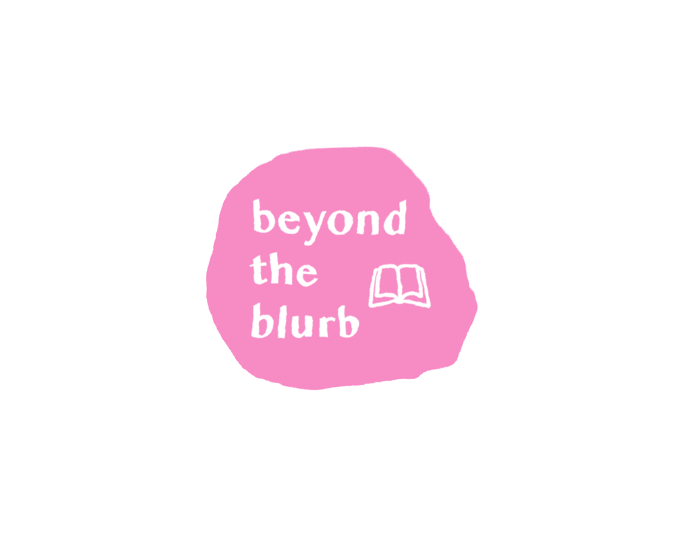
Animated Logo:
Animated Illustration:

(you may have to wait a few seconds for a GIF to restart)
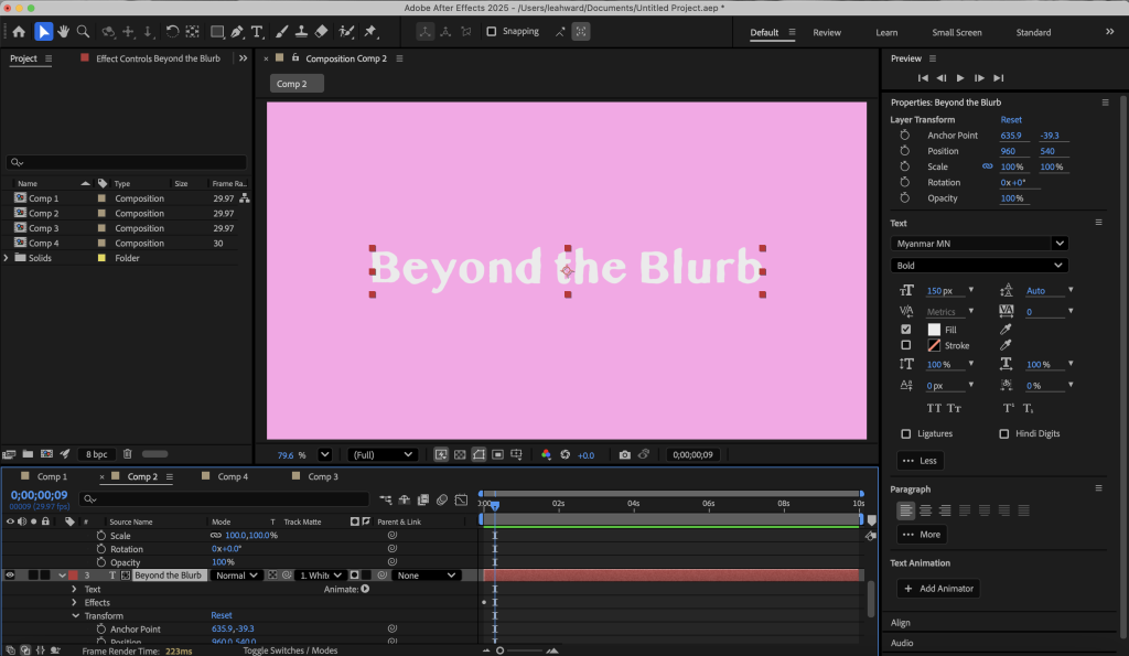
Some screenshots that evidence my use of the animation tools in Adobe After Effects:
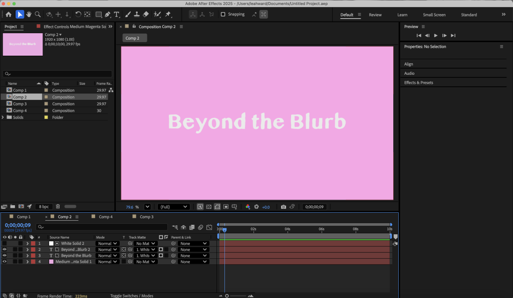
This project focuses on the development of a cohesive animated brand identity for a fictional book shop titled ‘Beyond the Blurb’. I decided to branch out from the idea of a regular book shop and create a unique concept behind the brand and intertwine it with a book club, as a space for girls to make friends, discuss different romance books, and enjoy refreshing iced coffee, matcha’s & delicious treats. This is how I came up with the name of the brand, as it’s more than a place to simply purchase books. I also enjoy the use of the double B’s as I think it’s catchy and is a very memorable name. Ultimately, the visual identity is centred around a soft, pastel colour palette consisting of pinks, greens, and muted tones, which were chosen to convey a sense of friendliness, calmness, and creativity. The organic, blob-shaped logo reinforces this informal and friendly tone, moving away from traditional, rigid, book shop branding. Moreover, the typography was chosen to be clean, sophisticated and clear, without appearing overly sleek and polished. In the animated typographic asset, the motion was used to introduce the brand name in a subtle and engaging way with a wobbly movement, helping to guide the viewer’s attention. Secondly, the animated logo was designed to feel soft and fluid, and the rotation helps to convey the playful idea of the book shop/club, reflecting the overall tone of the brand. Lastly, the illustration explores the idea of a book being flicked through as a dynamic, interactive object rather than in its static form. This links to the idea of exploring more than just the blurb. Furthermore, the animations were created using Adobe After Effects, applying keyframe techniques to control movement and transitions. There was lots of consideration given to the timing and pacing of the elements, to ensure the motion felt smooth and consistent with the brand personality. Overall, I believe the outcomes successfully demonstrates a consistent visual language across multiple assets as I initially learnt how to navigate Adobe After Effects.