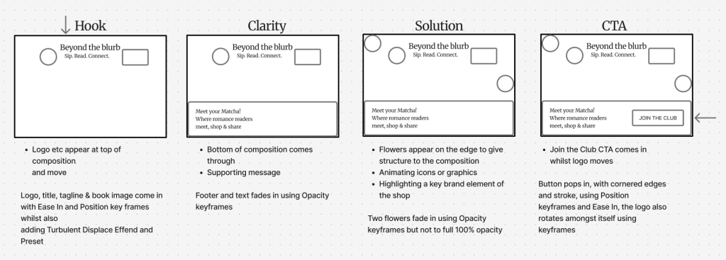
Storyboard planning of intended sequence:
Full Screen Web-Based Animation:
(Figure 1: flowers, Figure 2: book, Figure 3: background)
Some screenshots that evidence my use of the animation tools in Adobe After Effects:
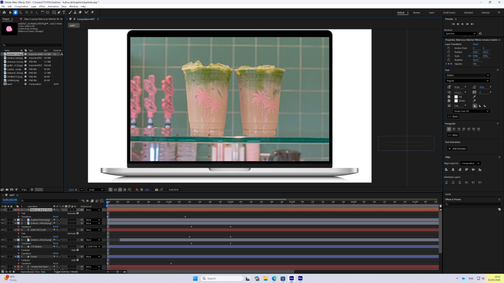
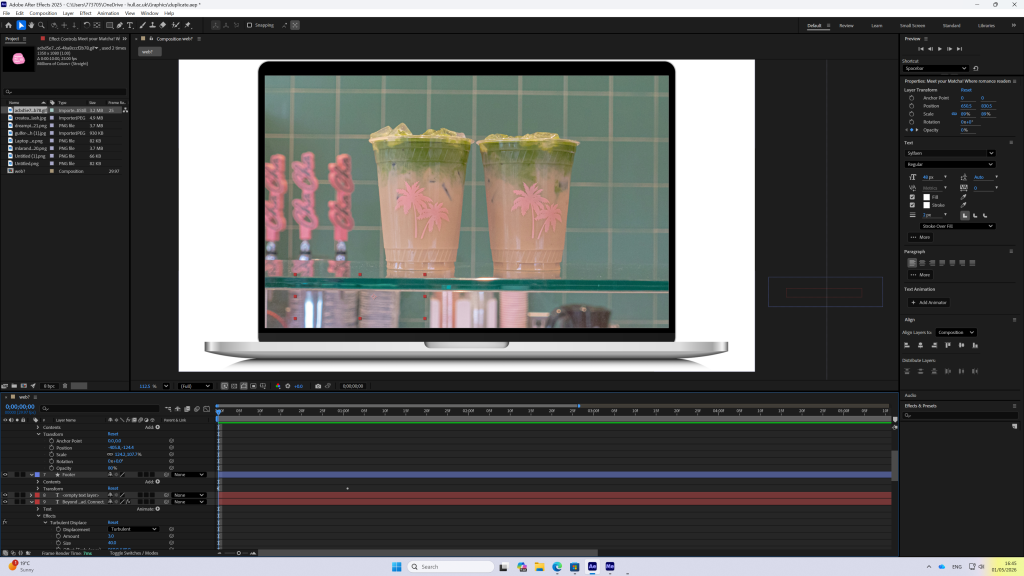
This design focuses on the creation of a full-screen web-based animation, as the main feature of a landing page concept for my fictional brand ‘Beyond the Blurb’. The aim of the animation is to efficiently communicate the brand’s identity as a girly, aesthetically pleasing book shop experience, that brings together books and lifestyle. Moreover, the concept was developed through initial storyboarding, structuring the animation into four key stages: hook, clarity, solution, and call to action. This approach ensured that the animation not only appeared visually engaging but also communicated information clearly and effectively. Furthermore, the visual design builds on the established brand identity, maintaining a consistent pastel colour palette and soft gradients. Elements such as flowers, matcha’s, and a book were used to create a trendy and inviting atmosphere, targeting a younger audience interested in books, friends, and aesthetically appealing spaces. In addition, depth was created by layering foreground and background elements, with objects moving at different speeds and in different ways. The animation was obviously developed using Adobe After Effects, ‘Turbulent displace’ from the Effects & Presets panel added a subtle, but consistent, wobbly moving element to the brand name & tagline ‘Sip. Read. Connect’. I created the rest of the design adding keyframe animations to control position, opacity, scale. etc. Timing and ‘Ease In’ were carefully considered to ensure smooth transitions that reflect the calm and relaxed tone of the brand. The final and main part of the landing page includes the animated logo, text, supporting visuals, and a clear CTA button encouraging user interaction and for users to ‘JOIN THE CLUB’. When creating this design I learnt that hierarchy is extremely important. I believe the last part of the animation as the logo rotating upon itself helps enhance this brands tone as something fun and playful. Additionally, I ensured the elements appearing on the screen happened fairly quickly and efficiently, without disconnecting from the relaxed vibe of the book shop, so the landing page was completed rather early on with only one moving element, allowing the user to view the complete landing page without waiting for more information or becoming overwhelmed. Overall, I believe this animation successfully communicates the brand’s personality and purpose within a short time frame and would encourage users to browse the website.
Reference List:
Figure 1: Adobe.com. (2025) Adobe Express. https://new.express.adobe.com/?_branch_match_id=1579987207578091383&_branch_referrer=H4sIAAAAAAAAA8soKSkottLXT0zJT0otLkgsyi7ILy7RSywo0MvJzMvWd8zL9ktxryjJ8E%2ByrytKTUstKsrMS49PKsovL04tsg1OTEssygQA5bdIOkUAAAA%3D [Accessed 30 April 2026].
Figure 2: Pixabay. (2017) Pixabay. https://pixabay.com/photos/bibel-heart-christianity-jesus-2615221/
Figure 3: Unsplash. (2025. Beautiful Free Images & Pictures | Unsplash. https://unsplash.com