‘Vertical Pizza Box’ by Pizza Hut
(Figure 1)
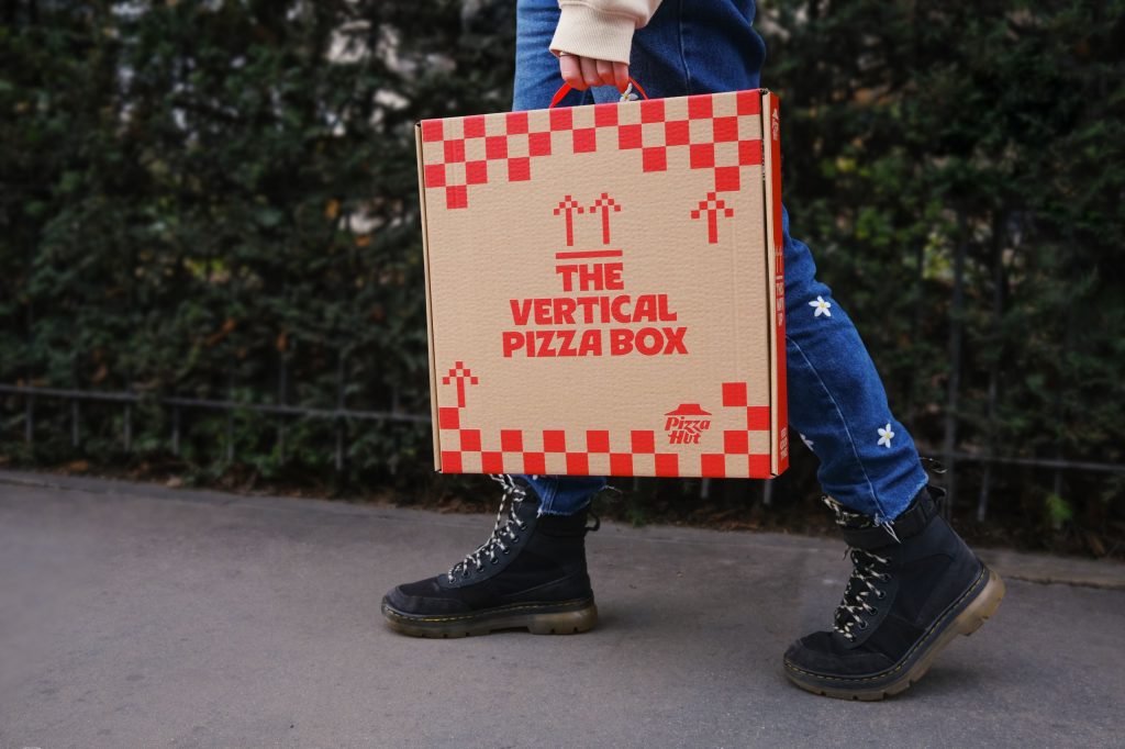
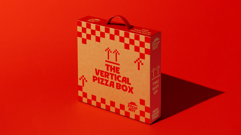
The Vertical Pizza Box campaign by Pizza Hut was built around a simple but unconventional idea, by placing a pizza box vertically in everyday public settings and allowing people to encounter it without giving any form of explanation, which was intentional from the brand. The visual concept was based on clash and surprise. It’s commonly known that a pizza box is understood as something that must remain flat, otherwise the pizza would slip out the box, therefore placing it upright immediately creates lots of curiosity. The art direction was deliberately minimal and grounded in reality. Instead of perfectly curated studio shots, the campaign used natural unpredictable lighting, street environments, and social filming, therefore making the idea have a genuine and authentic feel, as if it was a natural new found idea, instead of an intense advertisement. The restraint in branding allowed the object itself to become the main focus. Moreover, I believe the tone of voice is playful and ironic. The campaign didn’t involve any heavy influencing to make users invest in the brand, however it focused on a unique, controversial voice that intrigued others and got people looking and sparking conversations. They were extremely confident with the idea to allow the audience to have some confusion around the idea, however it was clarified that the vertical box was not replacing the standard pizza box. This allowed the tone to be entertaining and light hearted. Ultimately, this reinforced a brand personality that feels innovative, unique, and tuned in amongst different audiences, rather than purely transactional or led by making a profit. Furthermore, in terms of impact and effectiveness, the campaign’s great strength is its ability to create genuine engagement, simply through a form of visual disruption. By placing the box upright in public environments without any initial explanation, the brand created lots of speculation and discussion. The simplicity of it meant that the idea was clear, yet intriguing enough to strike conversation. From an art-direction perspective, this demonstrates confidence in the concept over excessive designing. The structure itself carried the idea, proving that form can communicate just as powerfully as imagery or text. The campaign appears to mostly intrigue younger, highly digital audiences. Those who are into visual experimentation and social-media trends are more likely to appreciate the unexpected placement and minimal branding. The vertical placement also mirrors phone screen proportions, aligning the physical object with contemporary content culture. I believe this campaign was designed to help Pizza Hut’s brand, as a lot of their restaurants are getting shut down and there is a minimal amount left. However, the concept may exclude older or more traditional consumers who prioritise practicality and easy-understanding. Without context, some audiences may view the idea as confusing or impractical, rather than new and innovative. If I were approaching this campaign as an Art Director, I would extend the concept further into another platform of storytelling. Introducing digital elements or collaborations could strengthen this idea and prevent the idea from feeling temporary and create something more long term. Ultimately, I believe the idea is powerful, but placing it within a wider idea would ensure the innovation feels purposeful rather than a one-off experiment.
Reference List:
Figure 1: Boom, C. (2026) Behold the ‘Vertical Pizza Box’ by Pizza Hut, spotted on London’s streets. https://www.creativeboom.com/news/behold-the-vertical-pizza-box-by-pizza-hut-spotted-on-londons-streets/ [Accessed 16 Feb 2026].